ADA Compliance Website Standards: An Ultimate Guide
In this article, we will explore key factors that make up an ADA-compliant website as well as ways to apply them to your business.

Did you know that the WHO estimates 1.3 billion people experience significant disability? When you do the math, this roughly represents 16% of the world’s population. This makes the disabled population the largest minority group. So when I tell you that only 3% of the web is accessible to people with disabilities… Well, you see the problem here.
Inaccessibility to websites means that people with disabilities cannot access the same information as those without them. And as a society that functions almost completely through technology, with 5.18 billion internet users worldwide, that leaves them at a real disadvantage.

Multiple services are now moving online, leaving people to rely on internet use like never before. Finding health and safety resources, voting information, and accessing public transportation schedules are just a few examples.
From a business perspective, excluding this large demographic leads to missing out on potential clients and revenue. And listen up, that’s not the only thing that can hurt your profits. Not meeting digital accessibility standards set by the Americans with Disabilities Act (ADA) can land you in the middle of a lawsuit. In this article, we will explore key factors that make up an ADA-compliant website as well as ways to apply them to your business.
What is the ADA?
The history of the Americans with Disabilities Act (ADA) began long before its signing ceremony at the White House in 1990. It began with the establishment of local groups to end the exclusion of disabled Americans from their own communities.
However, with the signing of the act came huge strides in the fight against this oppression. It prohibits discrimination against those with disabilities, ensuring the same opportunities and rights as those without them. The act covers sectors such as employment, transportation, education, and other public spaces.
The ADA covers physical accommodations in public locations, such as wheelchair accessibility and the use of braille. But in 2010, the U.S. The Department of Justice introduced the Americans with Disabilities Act Standards for Accessible Design. This act mandates all electronic and information technology be accessible to those with disabilities.
Websites now must be ADA-compliant to avoid potential lawsuits and legal ramifications. Blind users, deaf users and those who navigate by voice, screen readers or other assistive technologies must have access to your web content. But which businesses must comply with these ADA requirements?

State and Local Governments (Title II)
We will go over Title II of the ADA first. This prohibits discrimination against people with disabilities. Specifically discrimination in all services, programs, and activities of state and local governments. Communication between state and local governments must be as effective with those who have disabilities as they are with others.
Websites now offer these services, programs, and activities. Examples of these include applying for an absentee ballot, paying tickets, filing a police report, applying for state benefit programs and more. Title II ensures accessibility for all citizens is possible.

Businesses Open to The Public (Title III)
Title III prohibits discrimination against the disabled, just like Title II. The difference here however is that this Title applies to businesses open to the public. This is also referred to as “public accommodations” under the ADA.
Some examples of businesses open to the public are retail stores, banks, hotels, hospitals, food establishments, and so on. All goods, services, privileges, or activities offered by public accommodations must adhere to ADA requirements. And of course, this includes those things which are accessible online.
Businesses must take the proper steps to assist clients or customers with special needs. Services to provide appropriate communication aids for those with disabilities is one example of being ADA-compliant. These communications, or “auxiliary aids and services”, might include:
- Interpreters.
- Notetakers.
- Captions.
- Assistive listening devices.
Website Accessibility Barriers
Websites are often designed and set up in ways that don’t always foster accessibility. Barriers that make it difficult for people with disabilities to use websites are just as important to address as physical barriers, like steps to enter a building. Let’s take a look at some examples of website accessibility barriers.
Poor Color Contrast
Take for example people who struggle with viewing color. Those with limited vision of color (color blindness) may struggle with differentiating text from background color if there is not enough contrast between them. An example might be a light gray text on a light-colored background.
Use of Color to Given Information
Content that is dependent on color cues to convey information is limiting for those with color blindness. Like poor contrast when it comes to text and background of certain colors, not being able to tell the difference between important color cues leaves many users at a disadvantage.
What’s more, screen readers cannot tell the user the color of the text. This means that someone who is blind cannot know that a particular color conveys certain information. Red text on a form to show required fields is an example of this.
Lack of Text Alternatives
This example is pretty straightforward, but a lack of text alternatives on your website can mean a lack of accessibility for your clients. Those with blindness cannot see or understand the content of an image. This includes pictures, illustrations, charts and graphs, and so on.
It is important that for all images you provide text alternatives, conveying the purpose and importance of said image.
No Captions on Videos
Another straightforward one, adding captions to your videos. Luckily, most technology nowadays offers this mode of accessibility. People with hearing disabilities may not understand your video content if you do not supplement it with captions. And honestly, some people just like having captions anyway.
Inaccessible Online Forms
When we talk about online forms, let’s be real… No one likes filling them out. It’s boring, tedious, and overall just a hassle. However, they are important when it comes to healthcare information, government assistance, and the list goes on.
People with disabilities therefore must be able to navigate and fill out an online form. Things like labels that screen readers can convey to users, clear instructions, and error indicators with alerts are helpful for accessibility.
Mouse-Only Navigation
The lack of keyboard navigation or mouse-only navigation is a barrier that many people might not consider. Those who cannot use a mouse or trackpad will not be able to access information on your website. Offering the alternative of using keystrokes to navigate your website can help you stay ADA-compliant.
What is WCAG?
The ADA doesn’t offer set guidelines when it comes to website compliance, which can be good and bad. This gives you the chance to have more customization in how you want your site to function, but it can also leave you in a situation where you might forget to address a specific barrier.
That’s why organizations follow the Web Content Accessibility Guidelines (WCAG). These guidelines are a reference point for businesses to improve their digital accessibility, therefore bringing in more online traffic.

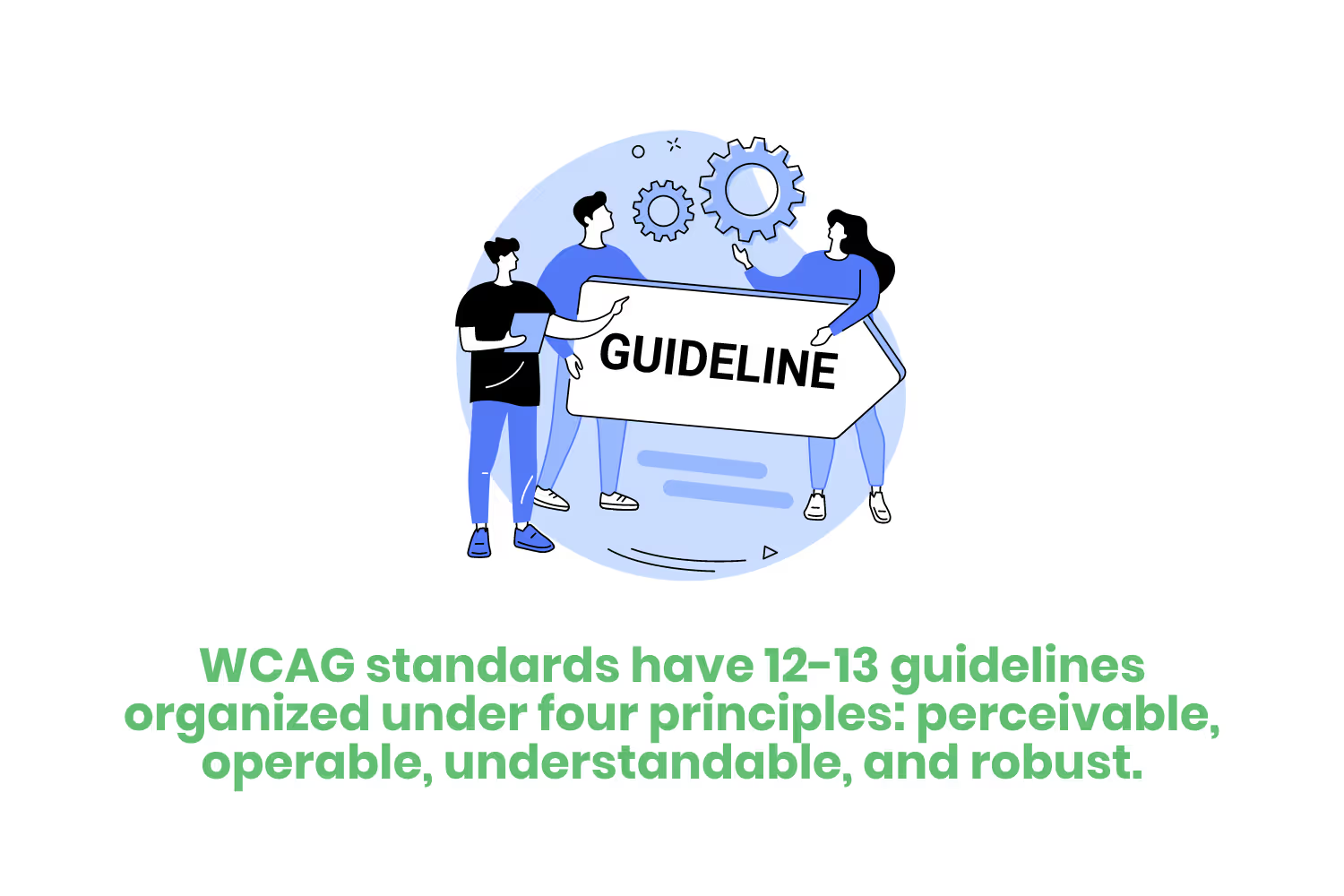
WCAG standards have 12-13 guidelines organized under four principles: perceivable, operable, understandable, and robust:
- Perceivable guidelines ensure that those with disabilities can easily access online content. This includes offering alternatives to text for sight-impaired users, such as audio alternatives and assistive technology.
- Operable guidelines cover the ability of people with disabilities to navigate a website. Keyboard accessibility for users to access your content is one example.
- Understandable guidelines make sure your website information is easy to… well, understand. For example, your site may offer assistive technology to make content readable and predictable while offering assistance if needed.
- Robust guidelines see to it that your website’s content is accessible through various devices and platforms. On a computer? Great. On a phone? No problem. A tablet? Say less. To be ADA-compliant, people with disabilities must have access to your website through all devices.
Each guideline has testable success criteria, and there are three levels:
- A is the bare minimum level of accessibility.
- AA is your target level of accessibility which meets legal requirements.
- AAA exceeds accessibility requirements.

How can you make sure you website is ADA-Compliant?
I’m sure you’re wondering how to make sure your website is ADA-compliant. There are several strategies when it comes to making your homepage accessible for everyone. Let’s go over a few of the most common ways organizations address accessibility issues associated with their online content.
- Create tags for all images, text, videos, and audio files.
- When encountering input errors, offer users alternatives and suggestions to better navigate your website.
- Create text transcripts for content such as videos and audio clips.
- Create an organized layout that has buttons clearly delineated from one another.
Conclusion
People with disabilities navigate life in a variety of different ways, and utilizing the internet is no different. Meeting ADA standards to improve your website’s accessibility is becoming increasingly monitored.
You don’t want to end up like Target in 2006. The retail company neglected to make sure its website was ADA compliant, and The National Federation of the Blind (NFB) took notice. In 2018, Target settled its class-action lawsuit and paid $6 million in damages.
Meeting WCAG standards improves your website’s accessibility for the disabled population while protecting you from a possible lawsuit.
Emphasize your product's unique features or benefits to differentiate it from competitors
In nec dictum adipiscing pharetra enim etiam scelerisque dolor purus ipsum egestas cursus vulputate arcu egestas ut eu sed mollis consectetur mattis pharetra curabitur et maecenas in mattis fames consectetur ipsum quis risus mauris aliquam ornare nisl purus at ipsum nulla accumsan consectetur vestibulum suspendisse aliquam condimentum scelerisque lacinia pellentesque vestibulum condimentum turpis ligula pharetra dictum sapien facilisis sapien at sagittis et cursus congue.
- Pharetra curabitur et maecenas in mattis fames consectetur ipsum quis risus.
- Justo urna nisi auctor consequat consectetur dolor lectus blandit.
- Eget egestas volutpat lacinia vestibulum vitae mattis hendrerit.
- Ornare elit odio tellus orci bibendum dictum id sem congue enim amet diam.
Incorporate statistics or specific numbers to highlight the effectiveness or popularity of your offering
Convallis pellentesque ullamcorper sapien sed tristique fermentum proin amet quam tincidunt feugiat vitae neque quisque odio ut pellentesque ac mauris eget lectus. Pretium arcu turpis lacus sapien sit at eu sapien duis magna nunc nibh nam non ut nibh ultrices ultrices elementum egestas enim nisl sed cursus pellentesque sit dignissim enim euismod sit et convallis sed pelis viverra quam at nisl sit pharetra enim nisl nec vestibulum posuere in volutpat sed blandit neque risus.

Use time-sensitive language to encourage immediate action, such as "Limited Time Offer
Feugiat vitae neque quisque odio ut pellentesque ac mauris eget lectus. Pretium arcu turpis lacus sapien sit at eu sapien duis magna nunc nibh nam non ut nibh ultrices ultrices elementum egestas enim nisl sed cursus pellentesque sit dignissim enim euismod sit et convallis sed pelis viverra quam at nisl sit pharetra enim nisl nec vestibulum posuere in volutpat sed blandit neque risus.
- Pharetra curabitur et maecenas in mattis fames consectetur ipsum quis risus.
- Justo urna nisi auctor consequat consectetur dolor lectus blandit.
- Eget egestas volutpat lacinia vestibulum vitae mattis hendrerit.
- Ornare elit odio tellus orci bibendum dictum id sem congue enim amet diam.
Address customer pain points directly by showing how your product solves their problems
Feugiat vitae neque quisque odio ut pellentesque ac mauris eget lectus. Pretium arcu turpis lacus sapien sit at eu sapien duis magna nunc nibh nam non ut nibh ultrices ultrices elementum egestas enim nisl sed cursus pellentesque sit dignissim enim euismod sit et convallis sed pelis viverra quam at nisl sit pharetra enim nisl nec vestibulum posuere in volutpat sed blandit neque risus.
Vel etiam vel amet aenean eget in habitasse nunc duis tellus sem turpis risus aliquam ac volutpat tellus eu faucibus ullamcorper.
Tailor titles to your ideal customer segment using phrases like "Designed for Busy Professionals
Sed pretium id nibh id sit felis vitae volutpat volutpat adipiscing at sodales neque lectus mi phasellus commodo at elit suspendisse ornare faucibus lectus purus viverra in nec aliquet commodo et sed sed nisi tempor mi pellentesque arcu viverra pretium duis enim vulputate dignissim etiam ultrices vitae neque urna proin nibh diam turpis augue lacus.


