Extraordinary Exam Rooms That You Wouldn't Mind Going To
Many new-age hospitals and practices realized the importance of how their exam rooms look years ago. They then reached out to interior designers and contractors to begin the overhaul. This blog post goes over some of the best.
We know that patients don’t like coming to their appointments, that’s not a secret. There’s a reason why strategizing new ways to engage with clients exists.
As a whole, though, the healthcare industry can sigh in relief. The general population is striving to live healthier.
More than half of Americans say they lived a healthier lifestyle in 2017, pointing to the validity of the statement I just made. That’s a motivating statistic for most doctors as that’s the ultimate goal of the healthcare industry, to help people live healthier lifestyles.
So if people want to live healthier then they’re going to go to their doctor when they don’t feel well, right?
Well, according to the United States Census Bureau people are visiting the doctor less than ever before.
American patients are contradicting themselves. They want to live a healthy life while trying to bypass a trip to the doctor.
On the surface, this doesn’t make sense but there are multiple reasons why this contradiction exists…
- Costs from treatment
- Nosocomephobia
- Stubbornness
- Long wait times
- Outdated furniture, decor and instruments
We’ve talked about the majority of these topics in other posts but we consistently come back to outdated furniture, decor and instruments. That’s because how your healthcare organization looks on the inside matters.
We’ve learned how including elements of nature throughout your facility increases patients’ ability to heal and how to speed up your waiting room with technology.
What else could you possibly enhance at your practice or hospital?
Well, let’s say that your patient has had a fantastic experience so far. You’ve made your facility easy to navigate, your staff greets your clients in a friendly manner and your waiting room feels welcoming.
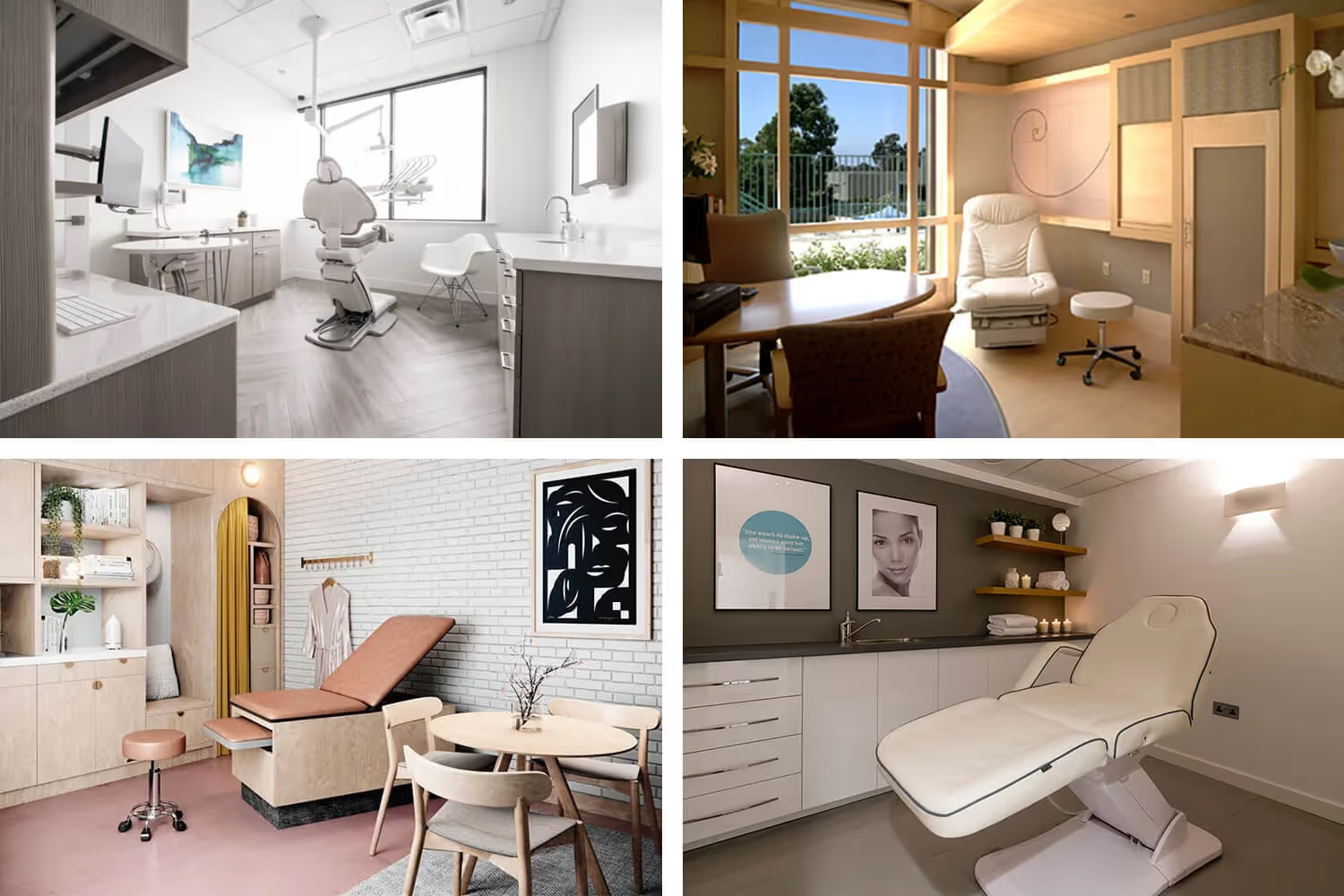
The next step in the process is to have the appointment. In order to do that your staff calls the client back and leads them to the exam room. Well, if your exam room looks like the picture below, everything that’s gone so well for your patients so far goes out of the window.
Your exam room is arguably one of the most important part of your healthcare facility. It’s the main setting where a doctor cultivates a relationship with their patients. It’s also the place where examinations, treatment plans and prescriptions happen most often.
Many new-age hospitals and practices realized the importance of how their exam rooms look years ago. They then reached out to interior designers and contractors to begin the overhaul.
Thus, they have some of the best looking exam rooms in the industry and their patients are less anxious about their appointment.
These exam room trailblazers serve as the perfect places to use as inspiration for your organization. This blog post goes over some of the best.
Parsley Health Center in NYC
When you think of 5th Avenue in New York City, the last thing you’ll think about is a medical facility. The street is famous as one of the most popular shopping districts in the world.
OK, now that I’m mentioning the thought of a healthcare center located on one of the busiest streets in one of the largest cities in the US, what does it look like in your mind.
It probably doesn’t look like the picture below.
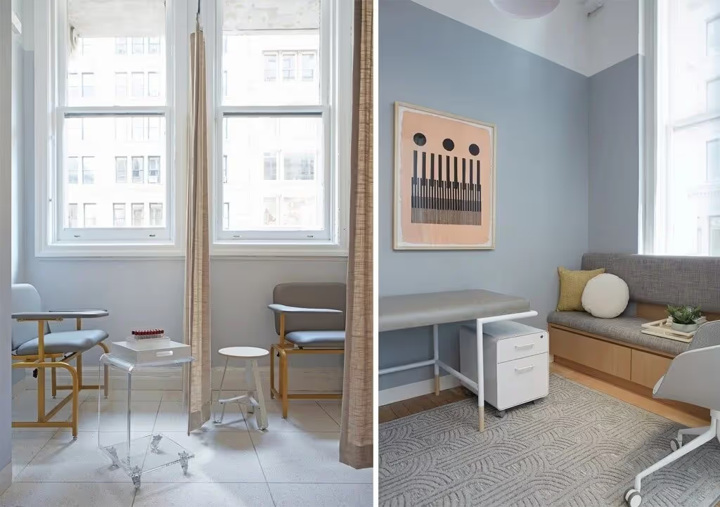
Those are pictures of what an exam room looks like inside NYC’s Parsley Health Center.
Although the Parsley Health has multiple locations, the one that opened up in January 2019 is the first office designed by the group from the ground up.
The organization’s entire business model centers around the fact that the average American spends about 20 minutes per year with their doctor. Parsley Health members spend around 4 hours.
The reality is that seeing your doctor for 4 hours a year to most people sounds like a headache. Unless, of course, your doctor’s office uses natural lighting and open areas designed to reduce stress.
They put so much thought into the office’s exam rooms that they even kept the hallways leading up to them in mind. Overhanging walls hide the halls coming off of the main common area. This pattern induces a sense of mystery upon their clients as they wonder what’s around the corner.
The rooms themselves focus making the patient to doctor relationship comfortable. The organization mainly achieves this motif by excluding a desk that separates the doctor from the patient.
The Smile Studio
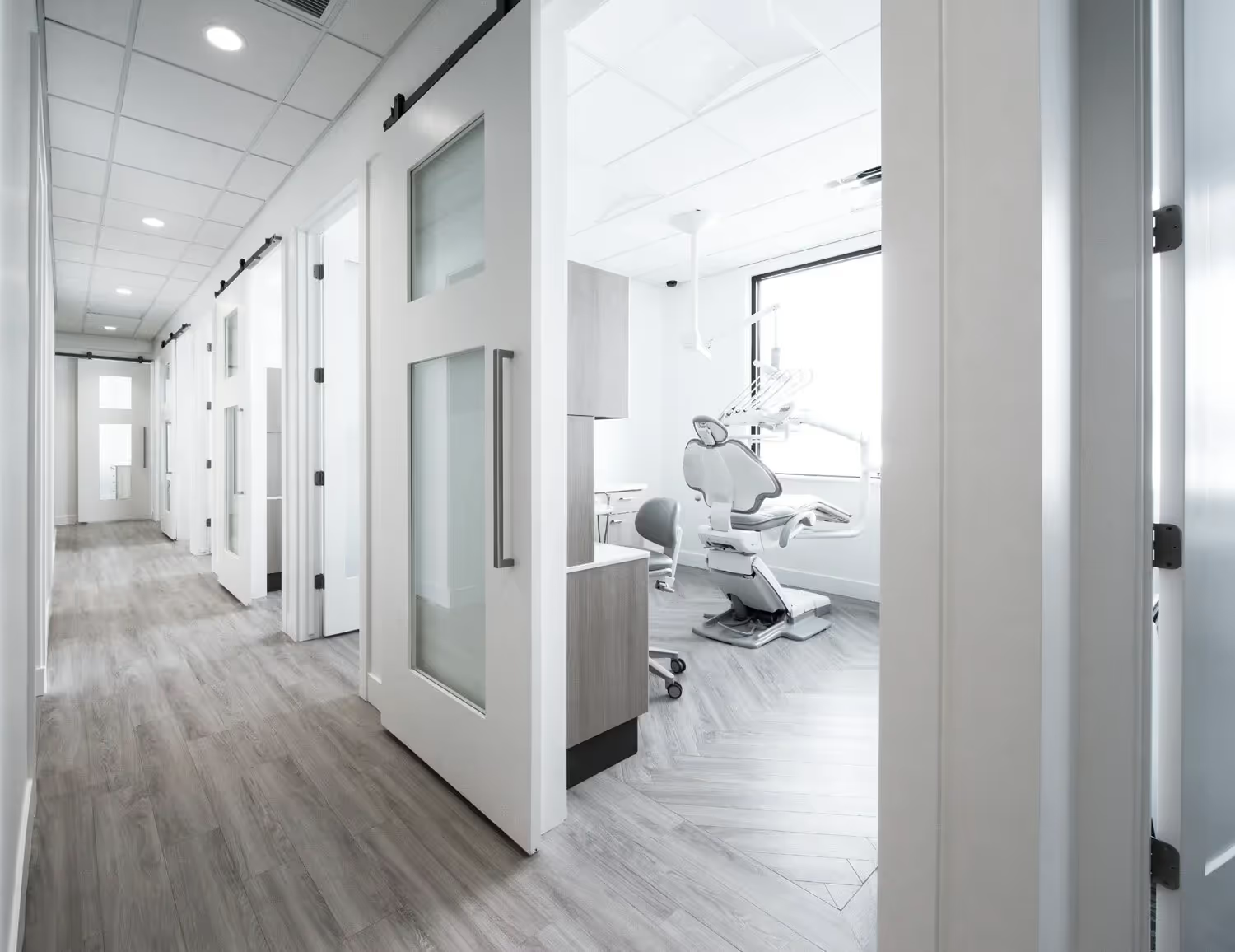
Out of all of the healthcare-related areas, patients especially hate going to get their teeth checked out.
60% of adults are afraid to visit the dentist.
It’s hard to blame them with all of the scraping and drilling that happens while they’re sitting in an uncomfortable reclining chair and staring at a bright light.
In order to combat that fear, patients need to be as comfortable as possible.
The Smile Studio in Orem, Utah created a cozy stay for their clients in five specific ways.
First, the entire office provides a modern, clean feel throughout with white walls and furniture. Second, each exam room is private. Third, the rooms contain a large reclinable chair for the patients and another Herman Miller chair for guests. Fourth, the position of the building won’t ever face direct sunlight on the patient, allowing for window treatment. Fifth, the chair that the patient sits on directly of a window that looks at mountains in the distance.
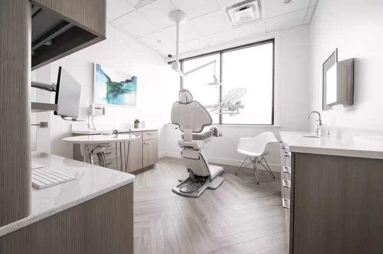
Every little detail mattered in the creation of this facility, especially within its exam rooms. In order to achieve such a patient-centric office, The Smile Studio reached out to the interior design agency, Bex Studios.
Scripps Center for Integrative Medicine
Some patients get the most anxious when they’re sitting inside of an exam room staring at all of the medical instruments surrounding them.
The standard room contains outdated medical posters about health tips, a diagnostic instrument panel, those yellow and red sharp object disposable containers, a glove box and blood pressure cuffs of all sizes.
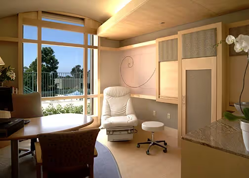
All of those items I just listed are essential pieces to an exam room but that doesn’t mean that they need to be out in the open. That’s one of the biggest aspects that Scripps Center for Integrative Medicine focused on with their redesigned exam rooms.
There are two distinct areas in each room thanks to Jain Malkin Inc.’s gameplan. There’s a desk and two chairs for eye-to-eye meetings with the doctor and of course the exam chair.
The chairs face away from giant bay windows that bring in natural light and highlight natural landmarks surrounding the facility.
The theme of each room is concealment and they’ve achieved this with three-part folding cabinets that double as a privacy screen for dressing.
The decor itself feels comfortable because of the neutral tones, wood trim, and granite countertops.
Eden Skin Clinic Kensington
There are certain treatments in healthcare that require an extremely comfortable location because of their personal nature.
The exam rooms at Eden Skin Clinic located in Kensington, UK creates a warm environment by paying attention to details like lighting, accent colors and the patient’s chair.
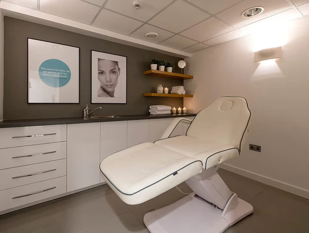
Their rooms utilize a simple design that produces a great response from those who receive treatment there.
Although skincare is a little bit different than traditional healthcare, it doesn’t make going in for a visit any less stressful.
Their entire clinic’s design came from Nikki Rees Interior Design.

Kindbody Fertility Wellness Center
Just because an organization is a healthcare facility doesn’t mean that it has to look anything like its counterparts. Kindbody is a woman-owned fertility wellness center with locations scattered across the United States.
The organization just opened up its location in San Francisco, CA where it looks more like a retail store than a doctor’s office.
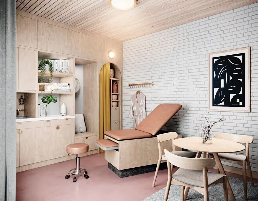
Everything within the facility works toward providing a welcoming and supportive environment. The architecture utilizes curved lines, warm lighting and organic forms. On the other hand, the interior design focuses on abstract art and color to achieve a soft and comfortable atmosphere.
Conclusion
You may have put a lot of effort into modern ways to get more patients through your doors. If that’s the case then you’ve probably started to see a small surge in new patients.
This is exactly what you want to see.
However, if your exam rooms look anything like the first picture I asked about in this blog post that surge in appointments you’re seeing now won’t continue. I’m not saying that getting new patients to come to your office isn’t important.
Instead, I’m pointing to the fact that retaining them is just as essential.
Retaining new patients requires the perfect balance of new technology, improvements in the experience you offer and a comfortable environment.
If the last thing you need on that shortlist is a comfortable environment and you don’t have the budget to overhaul your entire building, focus on improvements to your exam rooms as that’s where patients will be most anxious during their appointments with you.
Emphasize your product's unique features or benefits to differentiate it from competitors
In nec dictum adipiscing pharetra enim etiam scelerisque dolor purus ipsum egestas cursus vulputate arcu egestas ut eu sed mollis consectetur mattis pharetra curabitur et maecenas in mattis fames consectetur ipsum quis risus mauris aliquam ornare nisl purus at ipsum nulla accumsan consectetur vestibulum suspendisse aliquam condimentum scelerisque lacinia pellentesque vestibulum condimentum turpis ligula pharetra dictum sapien facilisis sapien at sagittis et cursus congue.
- Pharetra curabitur et maecenas in mattis fames consectetur ipsum quis risus.
- Justo urna nisi auctor consequat consectetur dolor lectus blandit.
- Eget egestas volutpat lacinia vestibulum vitae mattis hendrerit.
- Ornare elit odio tellus orci bibendum dictum id sem congue enim amet diam.
Incorporate statistics or specific numbers to highlight the effectiveness or popularity of your offering
Convallis pellentesque ullamcorper sapien sed tristique fermentum proin amet quam tincidunt feugiat vitae neque quisque odio ut pellentesque ac mauris eget lectus. Pretium arcu turpis lacus sapien sit at eu sapien duis magna nunc nibh nam non ut nibh ultrices ultrices elementum egestas enim nisl sed cursus pellentesque sit dignissim enim euismod sit et convallis sed pelis viverra quam at nisl sit pharetra enim nisl nec vestibulum posuere in volutpat sed blandit neque risus.

Use time-sensitive language to encourage immediate action, such as "Limited Time Offer
Feugiat vitae neque quisque odio ut pellentesque ac mauris eget lectus. Pretium arcu turpis lacus sapien sit at eu sapien duis magna nunc nibh nam non ut nibh ultrices ultrices elementum egestas enim nisl sed cursus pellentesque sit dignissim enim euismod sit et convallis sed pelis viverra quam at nisl sit pharetra enim nisl nec vestibulum posuere in volutpat sed blandit neque risus.
- Pharetra curabitur et maecenas in mattis fames consectetur ipsum quis risus.
- Justo urna nisi auctor consequat consectetur dolor lectus blandit.
- Eget egestas volutpat lacinia vestibulum vitae mattis hendrerit.
- Ornare elit odio tellus orci bibendum dictum id sem congue enim amet diam.
Address customer pain points directly by showing how your product solves their problems
Feugiat vitae neque quisque odio ut pellentesque ac mauris eget lectus. Pretium arcu turpis lacus sapien sit at eu sapien duis magna nunc nibh nam non ut nibh ultrices ultrices elementum egestas enim nisl sed cursus pellentesque sit dignissim enim euismod sit et convallis sed pelis viverra quam at nisl sit pharetra enim nisl nec vestibulum posuere in volutpat sed blandit neque risus.
Vel etiam vel amet aenean eget in habitasse nunc duis tellus sem turpis risus aliquam ac volutpat tellus eu faucibus ullamcorper.
Tailor titles to your ideal customer segment using phrases like "Designed for Busy Professionals
Sed pretium id nibh id sit felis vitae volutpat volutpat adipiscing at sodales neque lectus mi phasellus commodo at elit suspendisse ornare faucibus lectus purus viverra in nec aliquet commodo et sed sed nisi tempor mi pellentesque arcu viverra pretium duis enim vulputate dignissim etiam ultrices vitae neque urna proin nibh diam turpis augue lacus.


.avif)

