5 Free Chiropractor Invoice Templates & Receipts
Chiropractors can make their services more affordable without changing their prices. It all starts with the invoices you send. Here are 5 chiropractor invoice templates that will increase your bottom line.

65% of US adults seek care for neck and/or back pain in their lifetime.
To put that statistic more simply, there’s a massive need for chiropractors and the services that they provide.
But you already knew that.
According to Better Health Alaska, the average national cost for services provided by a chiropractor is between $100 - $150 per session. The same source states that the average length of each treatment is around 20 sessions.
Let’s run some numbers.
Your patients should expect to pay somewhere between $2,000 and $3,000 for your services based on those averages.
But there’s still a giant elephant in the room…your client’s ability to pay.
You see, only 18% of patients who seek a chiropractor’s services have full insurance coverage. That means that the majority of your clients will have to pay you out of their own pocket.
OK, so you just have to get a point-of-sale machine and charge your clients before they walk out the doors of your practice, right? It’s not that easy.
60% of US households cannot cover an unexpected expense that’s over $1,000.
Why Chiropractic Receipts and Invoices Matter for Your Practice
After all of these numbers, the point I’m trying to make is that many of your clients aren’t going to be able to pay you for the services that you provide.
Odds are you aren’t going to decrease the costs associated with your organization any time soon…and you shouldn’t.
But, how can you keep your doors open as a chiropractor if the clients you’re providing your services to can’t pay you?
There are a couple of answers to that question that will get answered throughout this blog post. But each of has have to do with how you’re charging your clients. Chiropractors can make their services more affordable without changing their prices. It all starts with the invoices you send.
What to Include in a Professional Chiropractor Invoice Template
A professional chiropractor receipt should clearly document care while remaining easy for patients to understand. A chiropractic receipt template should include:
- Patient information (name, address, contact details)
- Clinic name and NPI
- Date of service and appointment reference
- Description of services and services rendered
- CPT codes and diagnosis codes using Current Procedural Terminology
- Fee, co-pay, and total cost
- Payment method and payment terms
- Insurance provider details (if applicable)
- Notes for privacy and healthcare documentation
Including these elements ensures accurate billing, supports insurance claims, and protects your practice. Here are 5 chiropractor invoice templates that will increase your bottom line.
Template 1: Envelope Windows Matter
Maybe the reason why you have a lot of outstanding balances isn’t because of a patient payment problem. Maybe what you send gets lost in the clutter of the mailbox.
Think about how much mail you receive at your house on a given day. The reality is that the USPS delivers over 167 million pieces of First-Class Mail every day.
Unfortunately, that statistic means that you’re up against a lot of mailbox traffic.
How can the invoices you send stand out from so much congestion? Well, other than the size of the invoice you send (more on that later), it’s all about how you design your envelope.
No, I’m not saying you need to spend extra money on your print and mail provider to add color to your envelopes. Doing something like that costs a lot of money in ink, which isn’t something I would recommend.
Instead, the point I’m trying to make is that you need to take advantage of the double windowed envelope that you send.
You see, the industry standard is to send your invoices via a double-windowed #10 envelope.
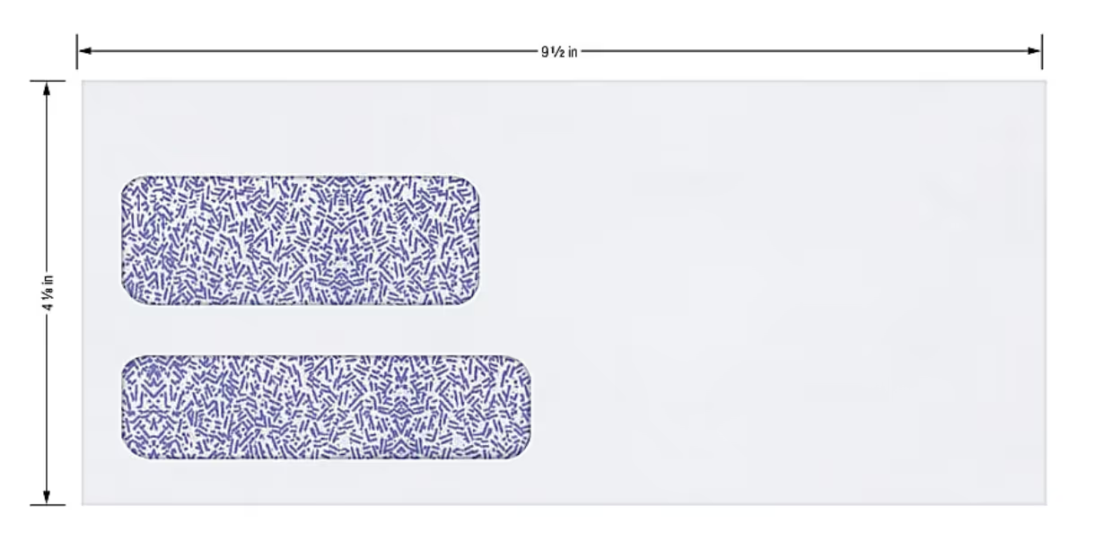
Of course, the immediate purpose of both windows is to provide information that’s helpful to the mail carrier in figuring out where to deliver the invoice to. Yet, they also provide an opportunity for you to present your brand to the recipient.

That’s why the first template focuses on what the recipient sees externally. Look at the difference between the two envelopes in the image above.
Both invoices went through the mail by the same chiropractor, yet the bottom envelope stands out much more than the one above it. From a functional perspective, they both contain the information required from the mail carrier.
But which of the two envelopes do you think would stand out more than the other in a giant pile of mail? The bottom one features the official logo of the practice.
98% of people check their mailbox every day. But, this usually happens after a long day at their full-time job. That means you need to take advantage of any opportunity that makes your invoices stand out from the pile of envelopes, magazines and coupon books.
Invoice Template 2: Make Your Chiropractor Invoices Readable
Let’s say that you already took advantage of the double window and make your logo visible through it…but you’re still sending a lot of overdue balances to collections.
In that case, it’s probably a matter of the readability of the invoices you send.
You see, there’s a reason why over 700 colleges nationwide offer a digital design major.
The reality is that if your clients can’t understand how much they owe you based on reading the invoices you sent them…they’re not going to pay you.
According to Microsoft, the average attention span is 8 seconds. In other words, you have that amount of time to convey to your clients how much they owe and how they can pay you. That’s a tiny window.
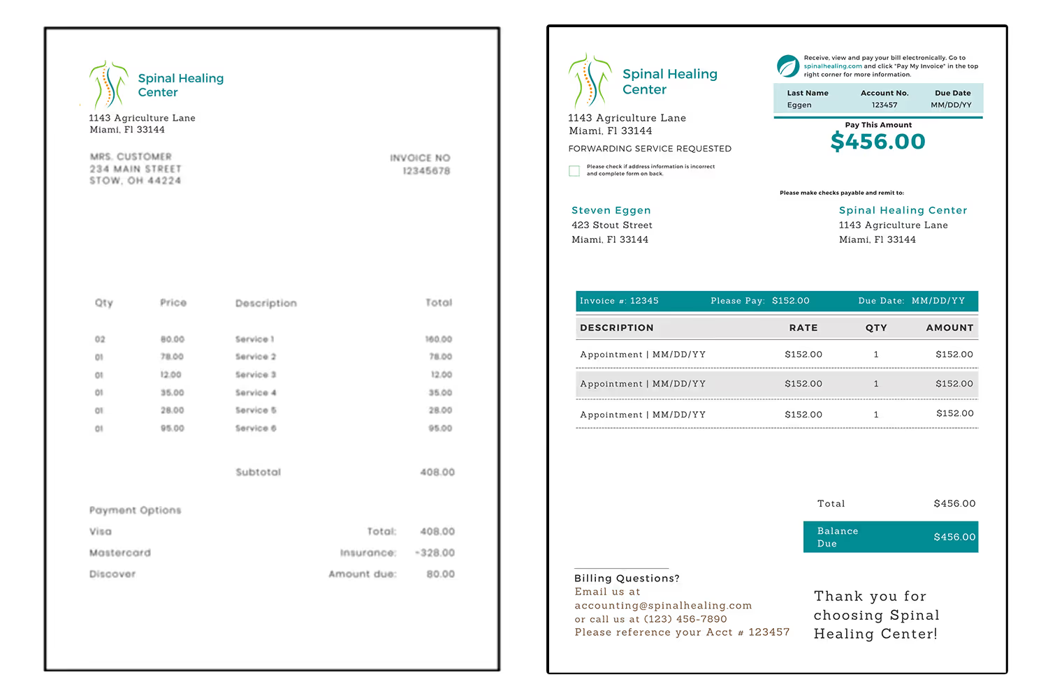
This second template is another comparison. Take a look at the visual difference between both of these invoice templates.
Which invoice did your eyes look at first? I’m willing to bet that your answer to that question is the one on the right.
The template on the right keeps design concepts in mind to help guide the recipient through a visual hierarchy. Those are two important factors that the template on the left fails to provide. It doesn’t have any visual elements that grab the reader's attention, requiring them to spend more time trying to figure out how to pay you. Not good.
Invoice Template 3: Remits Make Patient Payments Easier
I would be remiss if I didn’t harp on the importance of using remits.
In the invoicing world, a remit is an area at the top or bottom of a bill that’s tearable. It allows for your recipients to send back the tearable portion with their payment to you in a prepaid envelope that’s included in what you sent through the mail.
They also don’t limit the payment options that you accept.
Modern invoice remits provide a credit card box within them. In other words, all your clients have to do is fill out the credit card box with their billing information and payment preference, rip the perforated edge off of the remit and send their payment back to you through the mail.
It’s a super easy process that makes it even easier for your clients to satisfy their balance with you.
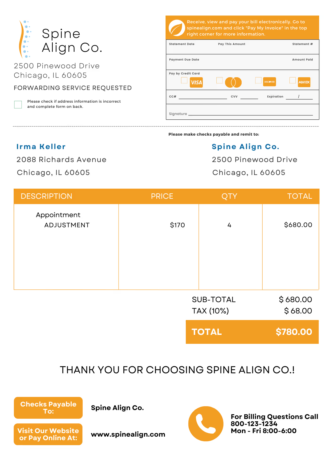
The template image above shows you what a remit looks like. The dotted line towards the top of the invoice represents the perforated, tearable edge. As you can see, the credit card box doesn’t take up much space and makes it easy for your clients to pay you how they want to.
In the eCommerce world, 7% of people abandon their cart because the retailer didn’t offer enough payment options.
That might not seem like a big percentage, but eCommerce sees a lot more transactions than your practice. Thus, you don’t want to take that chance.
Invoice Template 4: Dunning Messages for Billing Communication
I imagine you didn’t expect invoices to get so in-depth. I mean, at the end of the day they’re just a bill, right? Why should you care about the details?
Well, anything that you can do to enhance your invoice so that it’s easier for your clients to pay you is worth the extra effort. After all, you don’t want to have to outsource to a collections agency and pay for debt collection letters.
If you worked within the financial industry and I mentioned the term “dunning letter” to you, you would likely smile. Dunning letters help financial organizations communicate to clients the status of their accounts.
Sometimes the main reason why your clients don’t pay you is that they simply forgot that they owe you.
You could send reminder letters, but that might not be as efficient as utilizing dunning messages.
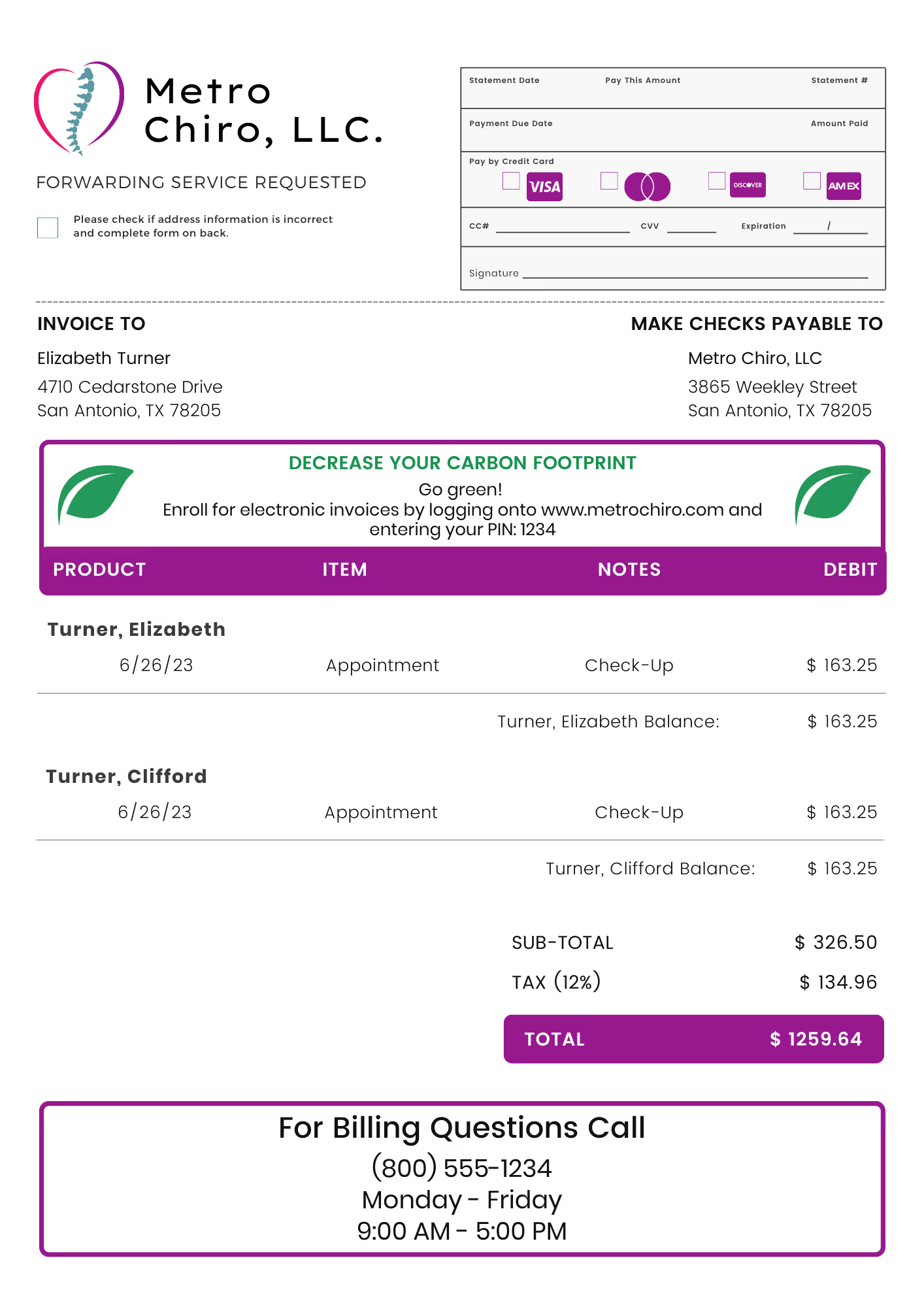
In the invoicing world, “dunning messages” provide you with an opportunity to communicate with your clients on their bills themselves.
The chiropractor invoice template above utilizes a dunning message for a different purpose. Rather than provide the status of the recipient’s account, it acts as an advertisement to enroll in electronic billing.
You simply can’t ignore the benefits of including dunning messages within the invoices you send. They help you from a collection and a marketing perspective.
Invoice Template 5: Payment Plans Pay Dividends
Way back at the beginning of this blog post I broke down the average cost of a chiropractor’s services and compared it to the cost threshold that the average American can’t afford.
It wasn’t a pretty picture.
It doesn’t take much math to realize that if your services cost more than what your patients can afford, you’re going to have a hard time collecting.
But again, you’re not going to decrease the prices associated with being a chiropractor.
So what’s the solution? Payment plans.
Payment plans provide a more affordable alternative to paying for your services.
You see, if your clients can’t afford to pay you…all of your collection efforts won’t work. But if you allow your clients to pay you in installments over the course of a few months, it’s easier to collect.
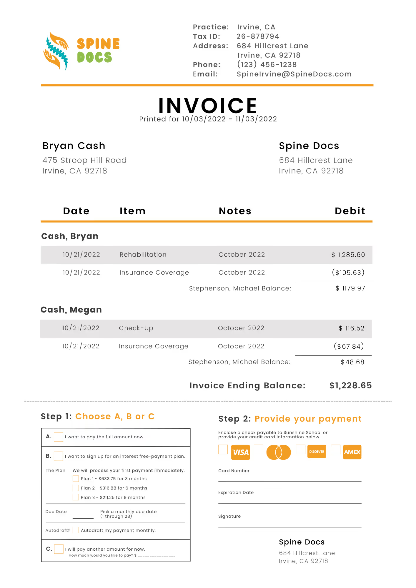
This chiropractor invoice template went through the mail but provides the ability for recipients to enroll in a payment plan as a bottom remit.
This example includes a two-step enrollment process that isn’t much more complicated than filling out a credit card box. Once complete, all the recipient has to do is tear off the perforated edge and mail the remit to your organization. From there, you enter the payment plan into your system and that’s it!
They pay off their balance with you consistently over the course of affordable installments, allowing you to accurately predict your revenue and decrease write-offs.
Download These Free Chiropractor Invoice Templates For Faster Revenue Collection
Chiropractors aren’t billers. In other words, they’re not going to focus more on the collections aspect of their practice. In a perfect world, they wouldn’t have to, either.
They would focus solely on providing chiropractic services for their clients. That’s why they became a chiropractor in the first place.
The reality is much different, though. Billing and closing outstanding balances are what keeps the lights on. Thus, without understanding where your financial bottlenecks are as a chiropractor, you’re going to risk writing off a ton of debt at the end of every year.
Understanding your financial bottlenecks starts with the invoices you send. Using these free chiropractic invoices can help you improve your documentation, support your compliance efforts, and help you collect revenue faster.
Emphasize your product's unique features or benefits to differentiate it from competitors
In nec dictum adipiscing pharetra enim etiam scelerisque dolor purus ipsum egestas cursus vulputate arcu egestas ut eu sed mollis consectetur mattis pharetra curabitur et maecenas in mattis fames consectetur ipsum quis risus mauris aliquam ornare nisl purus at ipsum nulla accumsan consectetur vestibulum suspendisse aliquam condimentum scelerisque lacinia pellentesque vestibulum condimentum turpis ligula pharetra dictum sapien facilisis sapien at sagittis et cursus congue.
- Pharetra curabitur et maecenas in mattis fames consectetur ipsum quis risus.
- Justo urna nisi auctor consequat consectetur dolor lectus blandit.
- Eget egestas volutpat lacinia vestibulum vitae mattis hendrerit.
- Ornare elit odio tellus orci bibendum dictum id sem congue enim amet diam.
Incorporate statistics or specific numbers to highlight the effectiveness or popularity of your offering
Convallis pellentesque ullamcorper sapien sed tristique fermentum proin amet quam tincidunt feugiat vitae neque quisque odio ut pellentesque ac mauris eget lectus. Pretium arcu turpis lacus sapien sit at eu sapien duis magna nunc nibh nam non ut nibh ultrices ultrices elementum egestas enim nisl sed cursus pellentesque sit dignissim enim euismod sit et convallis sed pelis viverra quam at nisl sit pharetra enim nisl nec vestibulum posuere in volutpat sed blandit neque risus.

Use time-sensitive language to encourage immediate action, such as "Limited Time Offer
Feugiat vitae neque quisque odio ut pellentesque ac mauris eget lectus. Pretium arcu turpis lacus sapien sit at eu sapien duis magna nunc nibh nam non ut nibh ultrices ultrices elementum egestas enim nisl sed cursus pellentesque sit dignissim enim euismod sit et convallis sed pelis viverra quam at nisl sit pharetra enim nisl nec vestibulum posuere in volutpat sed blandit neque risus.
- Pharetra curabitur et maecenas in mattis fames consectetur ipsum quis risus.
- Justo urna nisi auctor consequat consectetur dolor lectus blandit.
- Eget egestas volutpat lacinia vestibulum vitae mattis hendrerit.
- Ornare elit odio tellus orci bibendum dictum id sem congue enim amet diam.
Address customer pain points directly by showing how your product solves their problems
Feugiat vitae neque quisque odio ut pellentesque ac mauris eget lectus. Pretium arcu turpis lacus sapien sit at eu sapien duis magna nunc nibh nam non ut nibh ultrices ultrices elementum egestas enim nisl sed cursus pellentesque sit dignissim enim euismod sit et convallis sed pelis viverra quam at nisl sit pharetra enim nisl nec vestibulum posuere in volutpat sed blandit neque risus.
Vel etiam vel amet aenean eget in habitasse nunc duis tellus sem turpis risus aliquam ac volutpat tellus eu faucibus ullamcorper.
Tailor titles to your ideal customer segment using phrases like "Designed for Busy Professionals
Sed pretium id nibh id sit felis vitae volutpat volutpat adipiscing at sodales neque lectus mi phasellus commodo at elit suspendisse ornare faucibus lectus purus viverra in nec aliquet commodo et sed sed nisi tempor mi pellentesque arcu viverra pretium duis enim vulputate dignissim etiam ultrices vitae neque urna proin nibh diam turpis augue lacus.


