How to Create and Design Helpful Patient Education Materials
By reading this blog post, you now know some of the easiest and best ways to create and design effective patient education materials. Now all that’s left is to put in a little effort.

Almost a quarter of patients discharged at a hospital return for a repeat visit within 30 days.
I know what you’re thinking, “How does that relate to this blog post?”
Well, patients who have a clear understanding of their post-care instructions are 30 percent less likely chance of readmission than those who lack this information according to a different study.
So what’s the point I’m trying to make?
Even though patient education could largely save hospitals and practices from readmissions, it’s an area that’s not emphasized.
I’m not saying that healthcare organizations aren’t good at caring for their clients. Instead, I’m trying to point that a thousand conflicting priorities pop-up when administering care or determining a diagnosis.
In other words, patient education gets pushed aside for more pressing matters.
Alternatively, maybe it’s not a matter of priorities at all. Patient education may not happen as much as it should because healthcare employees don’t know how to design the materials. It’s possible that most hospitals walk their clients through everything during their visit but don’t have any additional information to give or refer them to.
If this is the case, then it’s not a matter of restructuring their entire informing process, it’s a matter of creating patient education materials.
If you find that your healthcare practice or organization is in a similar situation, you’re in the right place.
Keep Your Copy Simple
Have you ever read something that used an unnecessary amount of overly complicated words? We all have. In fact, we probably both know someone who does it in emails and texts in order to sound more verbose or intelligent.
Although this style of writing is appropriate for medical, scientific, and academic research papers, it’s not the route you want to go when creating your patient education materials.
All of your clients come from different backgrounds. They have different interests, opinions, jobs, and education levels from one another. You’ll need to keep all of these in mind when you’re writing patient-facing copy.
I’m not saying you need to create multiple versions of your materials to cater to the different education levels of your patients. That would require you to have at least 20 different versions and ask each person what their education level is before giving them additional information, which is silly and embarrassing.
Instead, use language in your copy that everyone can understand. That way you’ll only need one master version.
But how do you know whether or not your copy is too complicated while you’re writing?
Mirror your writing style off of journalists.
These professionals write a ton of content over the course of a year. In fact, The Post’s team produce around 500 stories every day. Of course, not all of those stories get published but those that do get read by hundreds of thousands of people.
The golden rule for writing for the general public is to aim between an 8th-grade and 10th-grade reading level.
Of course, the material you’re writing isn’t for the general public. But by following a similar rule you’re ensuring that your patients will be able to understand the material you give them.
Now, keeping the “golden rule” in mind while you’re writing is a great first step but how do you know whether or not your copy is too complex?
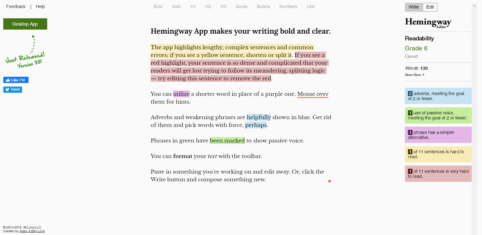
Use the Hemingway Editor online tool.

Hemingway gives you real-time feedback on the reading-level of your copy based on four criteria…
- Included adverbs
- Passive voice usage
- Complex words
- Sentence structure
The tool highlights your copy in different colors based on each criterion. By lowering the number of instances of each criterion, your copy’s reading level will drop.
To use this tool effectively, first write out the material for your patient education materials. Once complete, copy and paste it to Hemingway. Then edit everything within the tool until you reach a reading level within the sweet spot I mentioned earlier.
I do want to mention that you shouldn’t over-edit your copy with Hemingway.
The more you edit to fit the criteria of the tool, the less human your writing sounds. So hit the reading level you want and get rid of any passive voice then stop using the tool.
Use Modern Templates When Designing
Once you’ve finished writing and editing the copy for your patient education materials, you’ll need to start thinking about how to design them.
We’ve harped about the importance of design and all of its elements in a previous blog post about statements. But I’ll reiterate some of the main concepts.
By focusing on all of the different elements of design you’re accomplishing two things.
First, you’re making your patient education materials better looking which increases your brand perception.
Second, you’re also making it easier for your patients to remember. Robert E. Horn, a Stanford researcher, reiterated how design impacts comprehension, “...visual language has the potential for increasing ‘human bandwidth'—the capacity to take in, comprehend, and more efficiently synthesize large amounts of new information."
But how do you go about designing your patient education materials?
Well, if you were a professional graphic designer, you’d more than likely have a subscription to top of the line software. Of course, if you’re a doctor or practice administrator you don’t have the access or wherewithal to design programs.
Hiring a designer is an option but could get expensive charging between $65 and $150 per hour.
So what can you do?
There are two alternative options you can choose when designing your patient education materials.
First, if you want to be in control of what your materials will look like or make them yourself you can use Canva.
Canva is a freemium, web-based design tool that many marketers praise. It has hundreds of different templates, fonts, and elements to help you create your material.

The best part about this service is that it’s always getting updated with new templates. In other words, you won’t get stuck using twenty-year-old templates like you would if you used Microsoft Word.
Choosing to design your own patient-facing material is great but you need to ensure that you use modern styling. An outdated template or style will have the opposite effect you want by making it harder to comprehend the information.
Add Graphics For Emphasis
Believe it or not, we’re all visual learners.
If you really want to increase your patient’s comprehension of certain concepts or ideas, pair up your copy with a visuals. The proof that this works exists.
When a message and a visual exist together on the same page, people can recall 65% of the information 3 days later.
But, similar to the section above, you need to make sure that the graphics you include are well designed. If you use graphics or charts, they need to make sense. If you throw in a graph or chart just for the heck of it, it won’t end up having any context.

Don’t force graphs and charts into your design because I’m telling you to add them. Instead, add them to your material only if they reinforce your point or if it makes sense with the data you have.
Furthermore, just because graphics contains the word “graph” doesn’t mean that’s where these start and end. You could add stock photos, lead lines, quotes, callouts, icons, and illustrations.
Of course I have a few tips to keep in mind if you decide not to go the graph or chart route.
First, make sure that, whatever you add, is in a decent resolution. The last thing that you want to add to your fresh, modern-looking education materials is a blurry image.

Even just a little bit of blurriness makes a big difference in your reader’s perception of the quality of your material.
Second, if you add images. Make sure you do at least one of two things. You could either grab your images off of a free stock photo website like Unsplash or include the source underneath the pictures you use.

I recommend that you use free stock photos to ensure that you won’t accidentally run into any legal issues down the road. This also means that you shouldn’t use Google Images as your main source of graphics. Just because it’s in that tab doesn’t mean you have exclusive rights to use it.
Third, stay away from ClipArt. Yes, these images are free to use and widely available. However, they had their golden age in the 90s and early 2000s when Smash Mouth was at the number spot on the Billboards chart. Let’s leave them there.

As an alternative, use icons. Essentially, icons are the more modern and trendy looking version of ClipArt.
There are many different styles to choose from, not to mention they’re free to use. One of my favorite places to get these icons is Flaticon. It’s a search engine-powered library that has a ton of free icons to choose from.

My only word of caution when choosing icons is that you use similar styles.
Transfer Material Across Platforms
Way before a movie hits the big screen, there needs to be a script behind it. Oftentimes writers adapt those scripts from a book originally written by an author.
The point I’m trying to make is that everything starts with writing.
After you’ve written and designed your first round of patient education materials, you don’t want to throw away or delete the text file containing your copy.
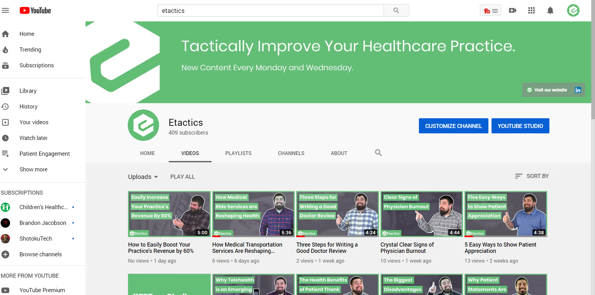
Instead, take that copy and turn it into a script for a video. Record the video and upload it to your practice’s Youtube channel.

Once it’s there, you can then reformat it for your social media accounts and share it there as well.
Transferring your education materials across different formats and platforms accomplishes two main things.
First, you most likely treat patients from different age groups and generations. Each generation expects a different experience in healthcare. In other words, making educational handouts aren’t for the Millennials or Gen Z patients you see. Likewise, your videos won’t get watched by many of the Baby Boomers you care for.
Of course, that doesn’t mean your younger patients aren’t allowed to grab a paper on their way out. Rather, you’re making your information more accessible to your client base.
Second, you’re inadvertently creating online content. Why is that significant? Creating content is one of the best and most effective ways to increase your patient volume. The material you post online isn’t exclusive to your clients. Other online users searching for information on the topics you’ve covered will end up coming across your content.
That’s a marketer’s dream.
As more people watch your content, you’ll eventually start to notice a higher volume coming through your doors.
Conclusion
Patient education largely falls by the wayside for both small practices and large hospitals because they both have too much on their plate. Other priorities come up.
But by investing some time and energy into making materials that will help your patients understand their ailment, treatment plan, or prescription will not only save you money in the longer run, it’ll reduce their chances of readmission tremendously.
By reading this blog post, you now know some of the easiest and best ways to create and design effective patient education materials. Now all that’s left is to put in a little effort.
Emphasize your product's unique features or benefits to differentiate it from competitors
In nec dictum adipiscing pharetra enim etiam scelerisque dolor purus ipsum egestas cursus vulputate arcu egestas ut eu sed mollis consectetur mattis pharetra curabitur et maecenas in mattis fames consectetur ipsum quis risus mauris aliquam ornare nisl purus at ipsum nulla accumsan consectetur vestibulum suspendisse aliquam condimentum scelerisque lacinia pellentesque vestibulum condimentum turpis ligula pharetra dictum sapien facilisis sapien at sagittis et cursus congue.
- Pharetra curabitur et maecenas in mattis fames consectetur ipsum quis risus.
- Justo urna nisi auctor consequat consectetur dolor lectus blandit.
- Eget egestas volutpat lacinia vestibulum vitae mattis hendrerit.
- Ornare elit odio tellus orci bibendum dictum id sem congue enim amet diam.
Incorporate statistics or specific numbers to highlight the effectiveness or popularity of your offering
Convallis pellentesque ullamcorper sapien sed tristique fermentum proin amet quam tincidunt feugiat vitae neque quisque odio ut pellentesque ac mauris eget lectus. Pretium arcu turpis lacus sapien sit at eu sapien duis magna nunc nibh nam non ut nibh ultrices ultrices elementum egestas enim nisl sed cursus pellentesque sit dignissim enim euismod sit et convallis sed pelis viverra quam at nisl sit pharetra enim nisl nec vestibulum posuere in volutpat sed blandit neque risus.

Use time-sensitive language to encourage immediate action, such as "Limited Time Offer
Feugiat vitae neque quisque odio ut pellentesque ac mauris eget lectus. Pretium arcu turpis lacus sapien sit at eu sapien duis magna nunc nibh nam non ut nibh ultrices ultrices elementum egestas enim nisl sed cursus pellentesque sit dignissim enim euismod sit et convallis sed pelis viverra quam at nisl sit pharetra enim nisl nec vestibulum posuere in volutpat sed blandit neque risus.
- Pharetra curabitur et maecenas in mattis fames consectetur ipsum quis risus.
- Justo urna nisi auctor consequat consectetur dolor lectus blandit.
- Eget egestas volutpat lacinia vestibulum vitae mattis hendrerit.
- Ornare elit odio tellus orci bibendum dictum id sem congue enim amet diam.
Address customer pain points directly by showing how your product solves their problems
Feugiat vitae neque quisque odio ut pellentesque ac mauris eget lectus. Pretium arcu turpis lacus sapien sit at eu sapien duis magna nunc nibh nam non ut nibh ultrices ultrices elementum egestas enim nisl sed cursus pellentesque sit dignissim enim euismod sit et convallis sed pelis viverra quam at nisl sit pharetra enim nisl nec vestibulum posuere in volutpat sed blandit neque risus.
Vel etiam vel amet aenean eget in habitasse nunc duis tellus sem turpis risus aliquam ac volutpat tellus eu faucibus ullamcorper.
Tailor titles to your ideal customer segment using phrases like "Designed for Busy Professionals
Sed pretium id nibh id sit felis vitae volutpat volutpat adipiscing at sodales neque lectus mi phasellus commodo at elit suspendisse ornare faucibus lectus purus viverra in nec aliquet commodo et sed sed nisi tempor mi pellentesque arcu viverra pretium duis enim vulputate dignissim etiam ultrices vitae neque urna proin nibh diam turpis augue lacus.


.avif)

