
Patient Statement Design Basics: Elements To Make Everything Understandable
We often don’t think about statement design elements when receiving these bills. Our main goal is to determine how much we owe, how to make the payment, and how to pay it off. There are different ways that you can ensure your statements are easy to follow. Everything starts with understanding basic design elements.

We often don’t think about statement design elements when receiving these bills. Our main goal is to determine how much we owe, how to make the payment, and how to pay it off.
But have you ever looked at a patient statement and get confused because you can’t follow the information? Or you can’t determine what you owe or understand what the charges are for? Patients are less likely to pay, or at least pay on time, if they don’t understand their bill.
If you don’t spend time designing your medical bills as a healthcare provider, this is bound to happen. But it doesn’t need to. There are different ways that you can ensure your statements are easy to follow. Everything starts with understanding basic design elements.
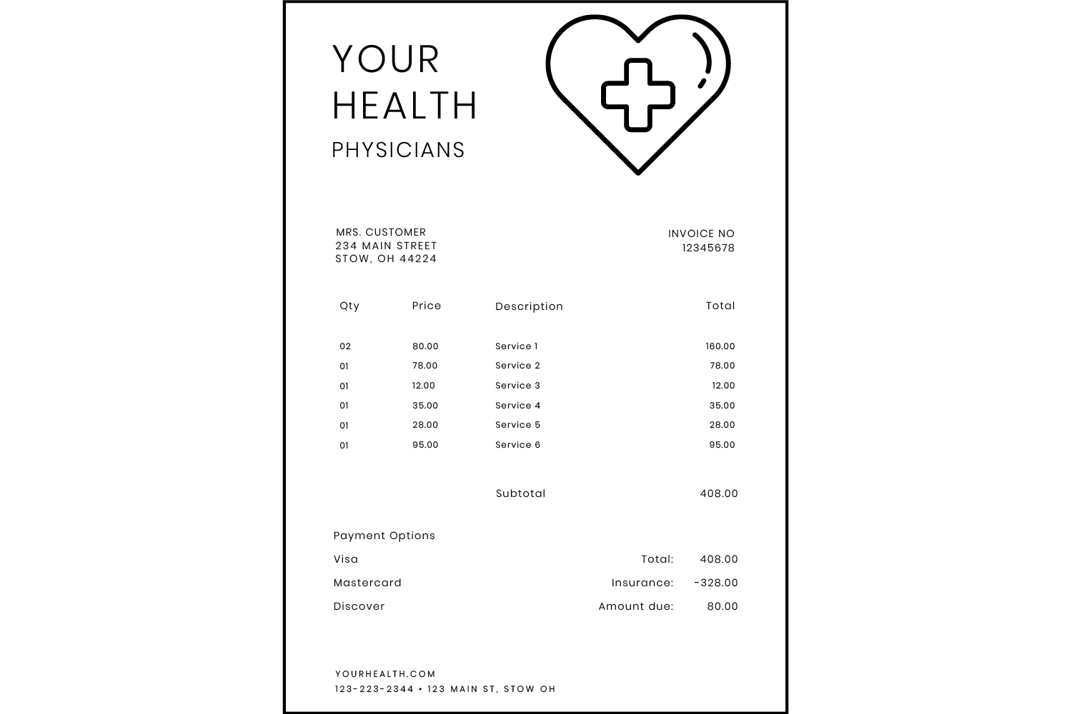
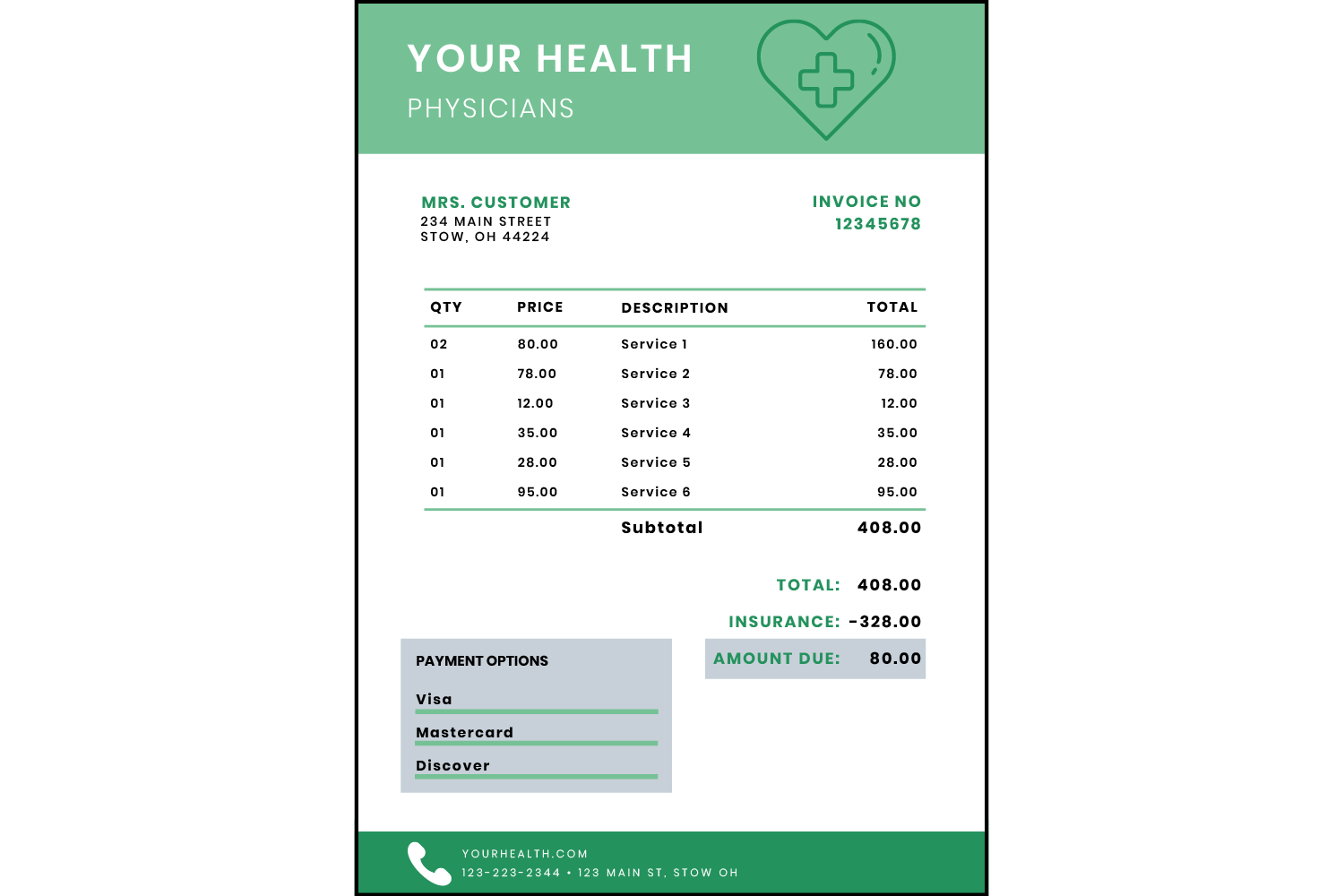
Let’s take a look at these components and principles, and how each one can make the above example easier to understand.
Color is Worth Additional Costs
This element is simple but has a huge impact. While black and white is cheaper and minimal, it doesn’t stand out. Black and white patient statements may get confused in piles of junk mail, while colors help emphasize what’s most important on your pages.
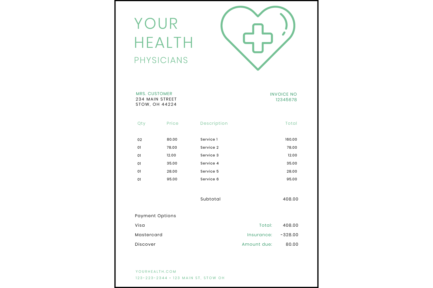
Of course, this doesn’t mean the entire statement design needs to be in color. After all, more color means you’ll have to pay more money up front.
Instead, choose colors with intention. The bill needs to be readable, so don’t make elements too light because they’ll be difficult to see. Also keep in mind that different colors may invoke certain feelings. As an example, red invokes urgency, error, or warning, so only use this color for areas that convey that type of message.
Specific color choice is also necessary for brand recognition. Using colors that reflect your company’s brand helps your clients understand that a statement is from you. You can use your colors in specific sections or certain text to draw attention to the most important information.
Contrast Brings Aesthetic
Contrast is what makes different elements stand out against each other. The most important areas should “pop” so that patients can identify the purpose of the bill. Contrast helps achieve emphasis, which means conveying the most important information.
If customers can’t locate where the total is, they won’t realize what they need to pay. So what’s the point of sending them a bill if they can’t find the most important piece of information?
You can achieve contrast in many ways but some of these are color, type, and size. Larger elements compared to smaller elements help draw draw the eyes to important information. For instance, the credit card box shouldn’t be the largest section on the page. The primary information here is the list of charges. And the most important charge is the total, so this should stand out among the others.
Shape Divides Content
We all know what shapes are. Not only does your patient statement design need to include important data, but it also needs shape. This helps makes all of the information more aesthetically pleasing.
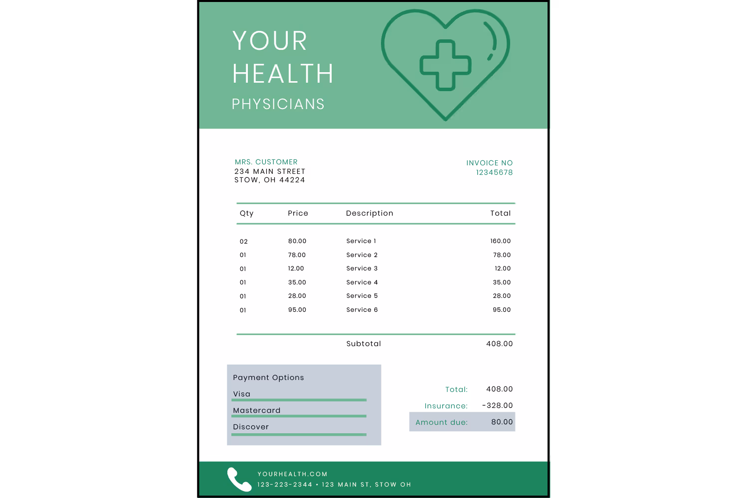
You can use basic shapes to emphasize important details and separate unrelated sections. For example, use rectangles around the list of charges to format it as a table. You can also use simple graphics to emphasize each section. Throwing in icons also helps direct patients. For example, using a phone icon for the company contact section or a credit card icon for payment options.
Typography Needs Thought Out
It’s most necessary that your statement design is readable. But don’t over do it, you’ll need to find a perfect balance. Customers will get frustrated if they need to spend a lot of time reading their bill to understand it.
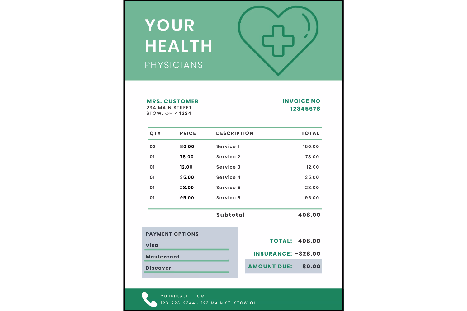
Typography is the design of letters and text. Characteristics of typography include size, weight, and typeface. The typeface is the form of text, such as Arial. Using a standard typeface such as Arial is easy to read because of the basic letter shape. Size and weight (thin, regular, bold) will draw attention to essential details. Reading words that are too small is difficult. You can successfully emphasize key information by using different sizes and weights.
Space Adds Balance
Space is an essential part of design. It helps us comprehend everything without getting overwhelmed with too much information. As mentioned before, spending too much time trying to figure out how much money you owe causes frustration. Just as text can make a statement easier to read, so can space. It’s difficult to follow a cluttered bill, which is why white space is necessary.
Also called negative space, these are areas that includes no elements. Think of this space as room to breathe. It helps break up details so we can process each section. But too much space could separate related information. You don’t want any important details to get lost.
Use space between each section with a different message. Create separate areas for the following:
- Payment options and credit card information
- Patient identification information
- List of services with charges
- Office information (hours, phone number, website)
- Any extra messages
Space should lead us through the design so that we process information in a logical order. It doesn’t make sense to have the company name be the largest element that stands out on the page. While clients need to know the statement is from you, the purpose is that they make a payment, not appreciate your logo.
In some cases, there may be too much information to include for one page. That happens more often than you may think. But it doesn’t mean you should sacrifice a well-spaced out design to include more information. Simply add a second page instead.
Repetition Brings Emphasis
Repetition is displaying the same information more than once. You should use this to convey the most important part of your statement: the total.
Patient statements list a description of services with their charges, what’s covered by insurance, and a total. It’s helpful to restate the total so that it’s easy to identify between other charges. Rather than just relisting it in the same way, add contrast for emphasis. Also include the total in the payment options section, so that when customers see their options they know how much they’ll be paying and won’t have to divert their eyes.
At first glance, this statement looks identical to the last image. But repeating the total amount in several sections reiterates the most important detail to the customer.

Be mindful of which details you repeat. You don’t want to repeat the same service charges, because then clients may think they’re getting double billed.
Alignment Guides The Eyes
Alignment is the principle that’s usually overlooked by non-designers. It refers to the arrangement of elements on the page. Alignment creates an order that we may not even notice until it isn’t there.
Imagine if you read a statement with the layout in the image below. Pay close attention to the table of services.

While you were looking at it, your eyes probably jumped all over the page or you ran your finger across each data point to see where it lined up. If related information doesn’t align, it’s difficult to follow how the elements relate to one another.
In this instance, it’s confusing to determine the final charge since the subtotal doesn’t align with the totals section. It’s also hard to follow which charge correlates to the corresponding service.
Conclusion
Now that you’ve seen the basic statement design elements, you know how much they can impact organization, emphasis, and overall appearance.
Let’s look at the final product:

The way you design your medical bills help patients better understand them. They can then determine the most important information and process each related detail. Lastly and most importantly, they can make their payments out to you without any questions or issues.
Emphasize your product's unique features or benefits to differentiate it from competitors
In nec dictum adipiscing pharetra enim etiam scelerisque dolor purus ipsum egestas cursus vulputate arcu egestas ut eu sed mollis consectetur mattis pharetra curabitur et maecenas in mattis fames consectetur ipsum quis risus mauris aliquam ornare nisl purus at ipsum nulla accumsan consectetur vestibulum suspendisse aliquam condimentum scelerisque lacinia pellentesque vestibulum condimentum turpis ligula pharetra dictum sapien facilisis sapien at sagittis et cursus congue.
- Pharetra curabitur et maecenas in mattis fames consectetur ipsum quis risus.
- Justo urna nisi auctor consequat consectetur dolor lectus blandit.
- Eget egestas volutpat lacinia vestibulum vitae mattis hendrerit.
- Ornare elit odio tellus orci bibendum dictum id sem congue enim amet diam.
Incorporate statistics or specific numbers to highlight the effectiveness or popularity of your offering
Convallis pellentesque ullamcorper sapien sed tristique fermentum proin amet quam tincidunt feugiat vitae neque quisque odio ut pellentesque ac mauris eget lectus. Pretium arcu turpis lacus sapien sit at eu sapien duis magna nunc nibh nam non ut nibh ultrices ultrices elementum egestas enim nisl sed cursus pellentesque sit dignissim enim euismod sit et convallis sed pelis viverra quam at nisl sit pharetra enim nisl nec vestibulum posuere in volutpat sed blandit neque risus.
Use time-sensitive language to encourage immediate action, such as "Limited Time Offer
Feugiat vitae neque quisque odio ut pellentesque ac mauris eget lectus. Pretium arcu turpis lacus sapien sit at eu sapien duis magna nunc nibh nam non ut nibh ultrices ultrices elementum egestas enim nisl sed cursus pellentesque sit dignissim enim euismod sit et convallis sed pelis viverra quam at nisl sit pharetra enim nisl nec vestibulum posuere in volutpat sed blandit neque risus.
- Pharetra curabitur et maecenas in mattis fames consectetur ipsum quis risus.
- Justo urna nisi auctor consequat consectetur dolor lectus blandit.
- Eget egestas volutpat lacinia vestibulum vitae mattis hendrerit.
- Ornare elit odio tellus orci bibendum dictum id sem congue enim amet diam.
Address customer pain points directly by showing how your product solves their problems
Feugiat vitae neque quisque odio ut pellentesque ac mauris eget lectus. Pretium arcu turpis lacus sapien sit at eu sapien duis magna nunc nibh nam non ut nibh ultrices ultrices elementum egestas enim nisl sed cursus pellentesque sit dignissim enim euismod sit et convallis sed pelis viverra quam at nisl sit pharetra enim nisl nec vestibulum posuere in volutpat sed blandit neque risus.
Vel etiam vel amet aenean eget in habitasse nunc duis tellus sem turpis risus aliquam ac volutpat tellus eu faucibus ullamcorper.
Tailor titles to your ideal customer segment using phrases like "Designed for Busy Professionals
Sed pretium id nibh id sit felis vitae volutpat volutpat adipiscing at sodales neque lectus mi phasellus commodo at elit suspendisse ornare faucibus lectus purus viverra in nec aliquet commodo et sed sed nisi tempor mi pellentesque arcu viverra pretium duis enim vulputate dignissim etiam ultrices vitae neque urna proin nibh diam turpis augue lacus.