How Typography Determines Patient-Friendly Statements
If it’s difficult to read or determine what they need to pay, they may give up altogether. But you don’t want your patients to skip paying their bills. This isn’t beneficial for anyone. This is why your organization must focus on the typography of your statement design to ensure it’s readable. There are several different aspects to consider.

Design elements can make medical statements more understandable for patients. There are so many ways that your organization can enhance these designs to help influence your patients to make payments.
But if they can’t read their bill, they can’t pay you. That’s why readability is the most important factor for patient-friendly statements. Your clients will get frustrated if they need to spend a lot of time reading. If it’s difficult to read or determine what they need to pay, they may give up altogether. But you don’t want your patients to skip paying their bills. This isn’t beneficial for anyone.
This is why your organization must focus on the typography of your statement design to ensure it’s readable. There are several different aspects to consider.

Understanding Typeface vs. Font
Before we dive further, let’s go over the difference between a typeface and a font.
Most people know the term “font.” People often confuse this word with the term “typeface.” When you think of fonts, you might imagine Arial or Times New Roman. But these are typefaces.
Typeface refers to the design of a set of letters and characters. Examples of typefaces are Arial, Times New Roman, Helvetica, and Georgia.
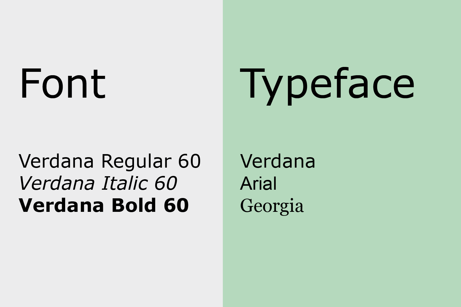
Fonts refer to the size and weight (thin, medium, bold, etc.) of a particular typeface. For example, Arial is a typeface while Arial bold 10 is a font.
Now that you understand the difference, let’s get into how typefaces and fonts can improve your statements.
Sans-Serif vs. Serif
Another key distinction to understand how typography determines the patient-friendliness of your statements is between sans-serif and serif.
A serif is a small line or stroke that projects from the larger stroke of a letter or character. A good way to picture these is to think of them like little feet. “Sans” means “without,” so sans-serif characters do not have these projections. As an example, you’re reading this blog post in a sans-serif typeface.
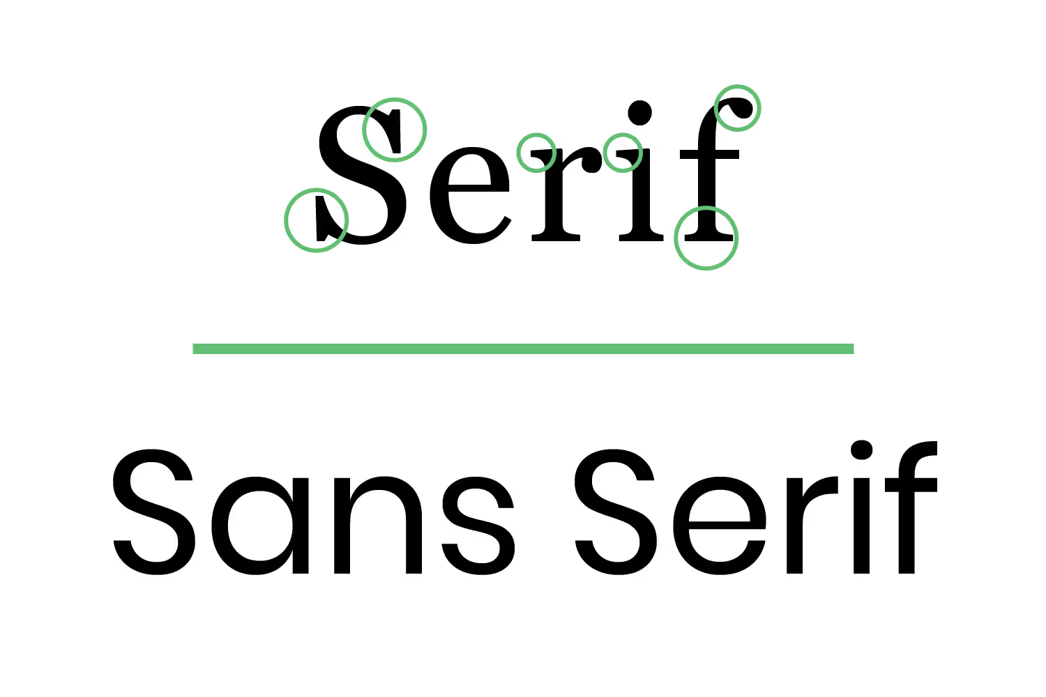
Sans-serif fonts are best for online-use. Computers usually have 100 dots per inch, a much lower resolution than printed works. A lower resolution makes small serif fonts more difficult to read than sans-serif. Small on-screen text is better in a sans-serif typeface.
All of this makes it sound like you should use serif for print then, right? Well, not always. Serif typefaces are easier to read in printed works, such as in novels. This is because serifs make characters more distinctive, which makes it easier for us to read and for our brains to process everything. You’ll find serif typefaces in the body text often. Since that’s where the majority of the information is located, you’ll be able to read it faster.
But sans-serif typefaces are more common for headings or captions and table-text. While serif typefaces are good for areas that contain a lot of information, consider using sans-serif typefaces for short sections.
Choosing a Typeface
So now that you understand sans-serif and serif typefaces, you can choose one that best fits your statement.
You shouldn’t choose just any typeface, though. There are different styles such as decorative, handwritten, and script.

While these typefaces can be interesting and fun to look at, especially if they match your logo, using these won’t make your statement patient-friendly. They aren’t easy to read at a glance and might strain your eyes. No one wants to spend more time than necessary reading through their statements. Imagine trying to read the fonts in the above image if they were smaller, your eyes would get sore in an instant.
Stick to simple, basic typefaces. Don’t overdo it either by using many typefaces. A general rule is to use no more than two typefaces - one for titles, and one for body text. You don’t want your statement looking like a ransom letter. Using too many creates too much contrast, so it’s difficult to know which text is the most important.
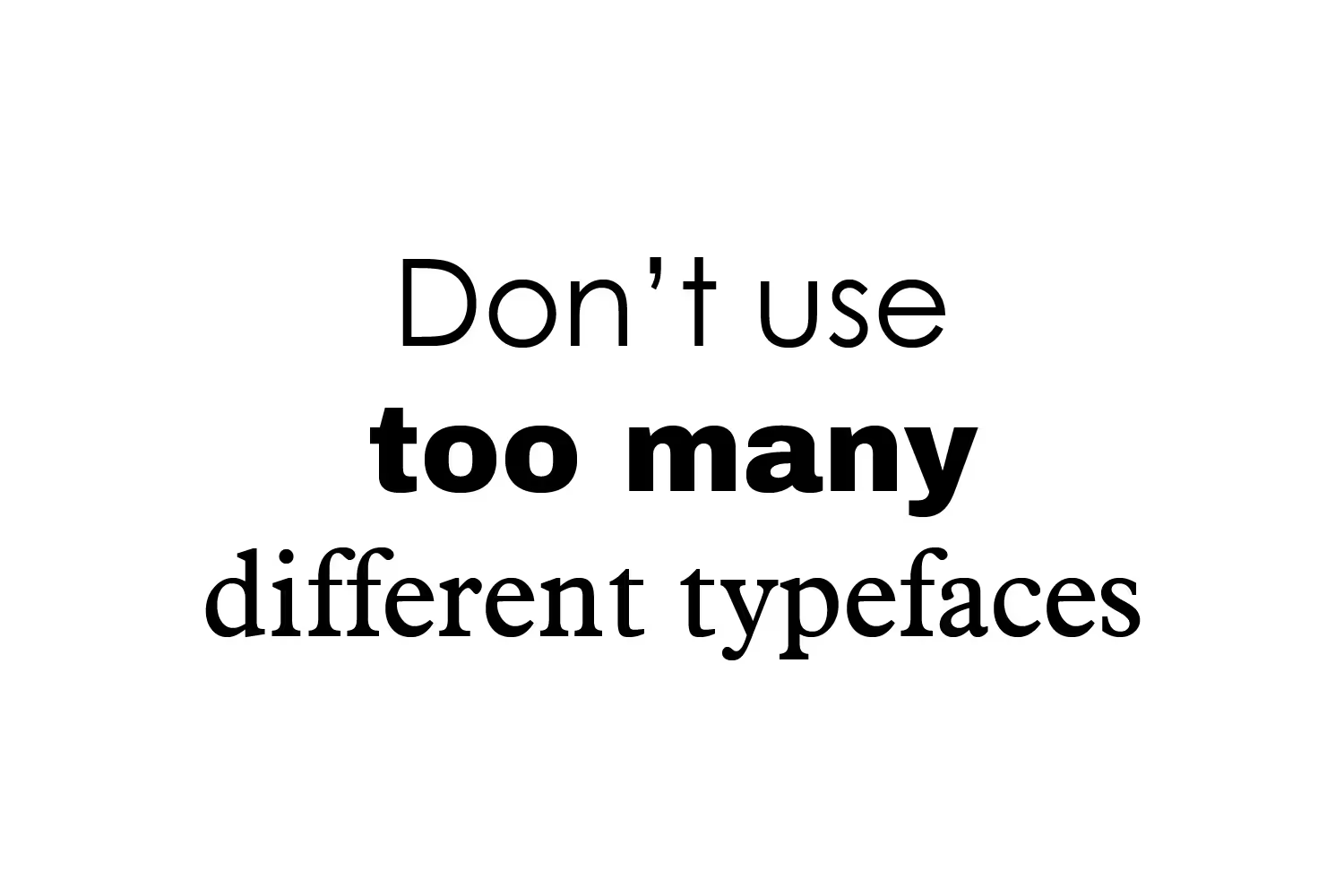
There are ways to achieve contrast between headings, subheadings, and body text by using only one typeface. This is where fonts become important.
Using Font Styles to Design a Patient-Friendly Statement
As mentioned before, font refers to the weight and size of a specific typeface. Once you select a typeface, you need to consider the font for each area within your statement.
Different weights and sizes between sections draw attention to the more important details. For example, if you used the same size text for every charge amount then the total charge would not stand out. Making the subtotal amount bold, larger or both places more emphasis on it over other information on the page.
Your organization’s information such as phone number and office hours aren’t the most important details, so these shouldn’t be in large text. But if they’re a small size, they could be too difficult to read. This could frustrate those who need to contact your office but can’t locate your information.
Keep your demographic in mind when designing statement text. An older or disabled demographic may have difficulty reading important details in small fonts. Luckily, the Americans with Disabilities Act (ADA) gives typeface and design guidelines (hint: keep these in mind while designing a patient-friendly statement)...
- Non-glare finish
- Can be uppercase, lowercase, or a combination of both
- Conventional in form
- No italics, obliques, scripts, highly decorative or unusual forms
- Fonts need to have a certain proportion where the width of the uppercase letter “O” is 55 percent minimum and 110 percent maximum of the height of the uppercase letter “I”
- Stroke thickness of the uppercase letter “I” shall be between 10 and 30 percent the maximum height of the character
- Spacing between characters should be between 135 and 170 percent the maximum of the character height
With all of these character requirements, only a handful of fonts pass; (san-serif) Helvetica, Arial, Futura, Gill Sans, Avant-Garde, Trebuchet, Verdana, Franklin Gothic, VAG Rounded, Frutiger, and (serif) Garamond, Century Schoolbook, Glypha.
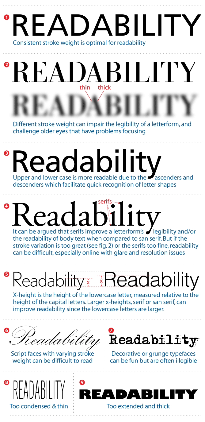
These may seem like strict regulations to have an ADA compliant statement, but they’re assuring that your aging or disabled audience can read what they owe. If they can’t, they’ll be less likely to make payments.
Different weights can convey different messages, too. Heavy and bold weights invoke urgency, almost as if it’s shouting. Don’t use heavy weighted text for information that isn’t urgent or important.
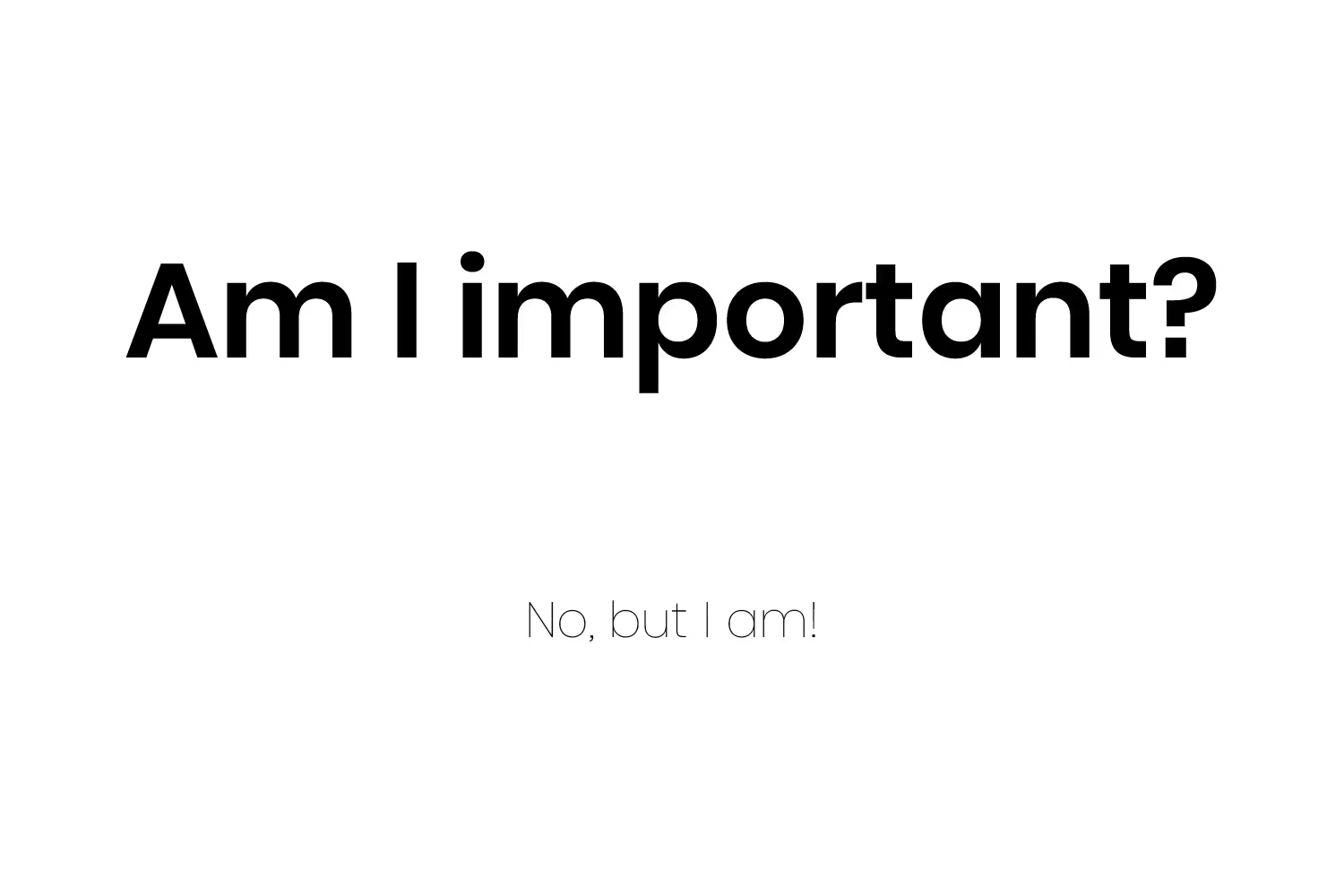
Another aspect of font styles is how close the characters are to each other. For example, some fonts have a “condensed” or “narrow” option. This means that the letters are closer together. While this can help with fitting more information, it can make text harder to read if it appears squished.
Some characters appear closer together even without this option depending on the font you’re using. Or, the lines of text may appear too close together making it difficult to read a section of text. Even fixing these issues can make your statement easier to read.
Leading, Kerning and Tracking
These are terms most people don’t recognize unless they’re graphic designers. Let me explain these in simple terms.
Leading - Adjusts the space between lines of text.

Tracking - Adjusts the space between all letters in a word.

Kerning - Adjusts the space between two characters.
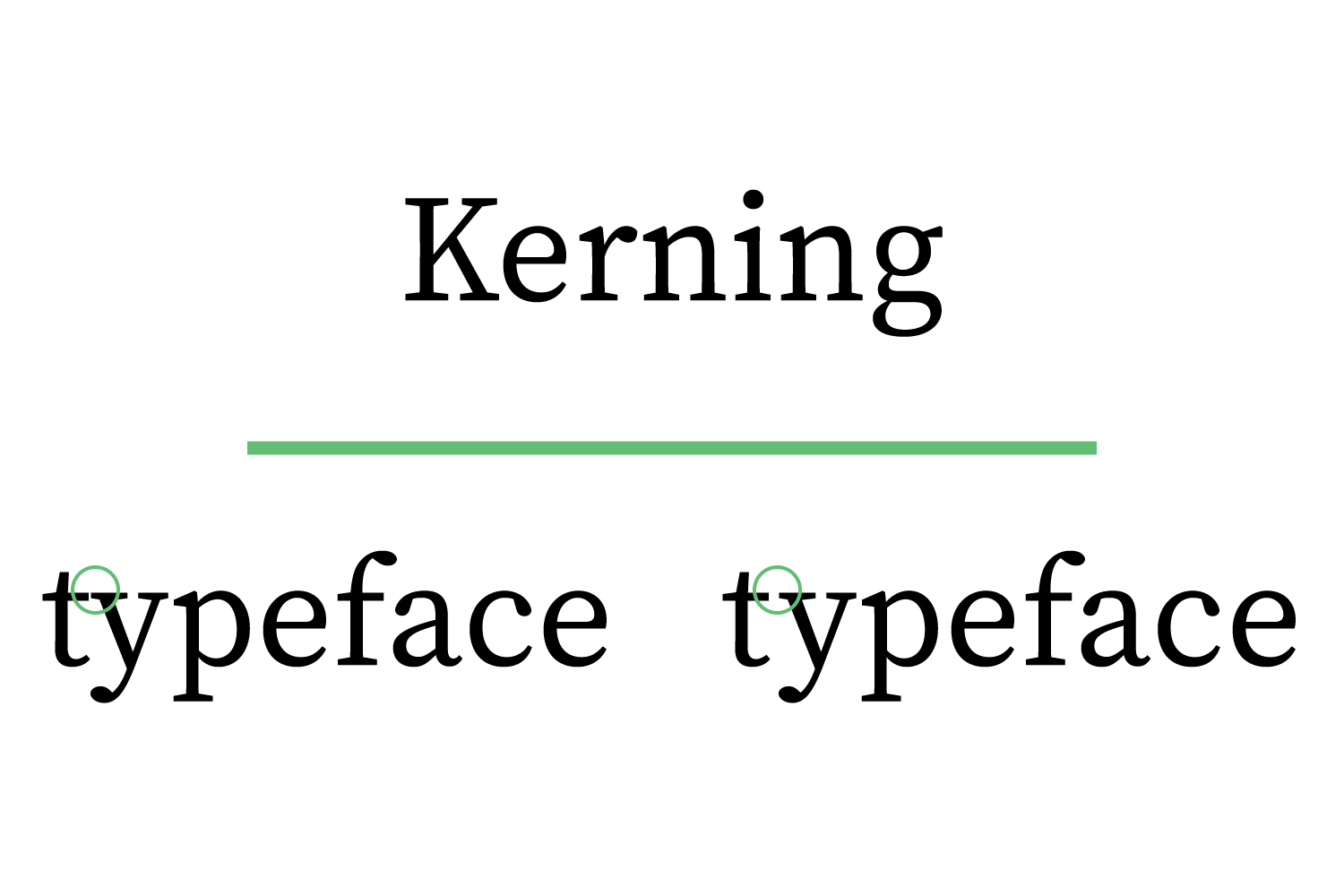
Some typefaces have default spacing that may need adjusting to make them more appealing. Making these adjustments can space text so it’s easier to read. But adjusting these too much though could break up the text so that people read it as separate pieces of information. You should use these tools with care and precision so that you don’t worsen the readability.
Conclusion
If your practice uses a statement that’s difficult to read, your patients will have a hard time paying you what they owe. No one enjoys paying their bills, but making them easier to follow makes this process much easier.
Poor typography design makes it harder for patients to find the most important information. It will be frustrating to patients if they must spend a lot of time reading their bill to understand it.
But by following these aspects of typography design, you’re on your way to sending out patient-friendly statements that are appealing to read.
Emphasize your product's unique features or benefits to differentiate it from competitors
In nec dictum adipiscing pharetra enim etiam scelerisque dolor purus ipsum egestas cursus vulputate arcu egestas ut eu sed mollis consectetur mattis pharetra curabitur et maecenas in mattis fames consectetur ipsum quis risus mauris aliquam ornare nisl purus at ipsum nulla accumsan consectetur vestibulum suspendisse aliquam condimentum scelerisque lacinia pellentesque vestibulum condimentum turpis ligula pharetra dictum sapien facilisis sapien at sagittis et cursus congue.
- Pharetra curabitur et maecenas in mattis fames consectetur ipsum quis risus.
- Justo urna nisi auctor consequat consectetur dolor lectus blandit.
- Eget egestas volutpat lacinia vestibulum vitae mattis hendrerit.
- Ornare elit odio tellus orci bibendum dictum id sem congue enim amet diam.
Incorporate statistics or specific numbers to highlight the effectiveness or popularity of your offering
Convallis pellentesque ullamcorper sapien sed tristique fermentum proin amet quam tincidunt feugiat vitae neque quisque odio ut pellentesque ac mauris eget lectus. Pretium arcu turpis lacus sapien sit at eu sapien duis magna nunc nibh nam non ut nibh ultrices ultrices elementum egestas enim nisl sed cursus pellentesque sit dignissim enim euismod sit et convallis sed pelis viverra quam at nisl sit pharetra enim nisl nec vestibulum posuere in volutpat sed blandit neque risus.
Use time-sensitive language to encourage immediate action, such as "Limited Time Offer
Feugiat vitae neque quisque odio ut pellentesque ac mauris eget lectus. Pretium arcu turpis lacus sapien sit at eu sapien duis magna nunc nibh nam non ut nibh ultrices ultrices elementum egestas enim nisl sed cursus pellentesque sit dignissim enim euismod sit et convallis sed pelis viverra quam at nisl sit pharetra enim nisl nec vestibulum posuere in volutpat sed blandit neque risus.
- Pharetra curabitur et maecenas in mattis fames consectetur ipsum quis risus.
- Justo urna nisi auctor consequat consectetur dolor lectus blandit.
- Eget egestas volutpat lacinia vestibulum vitae mattis hendrerit.
- Ornare elit odio tellus orci bibendum dictum id sem congue enim amet diam.
Address customer pain points directly by showing how your product solves their problems
Feugiat vitae neque quisque odio ut pellentesque ac mauris eget lectus. Pretium arcu turpis lacus sapien sit at eu sapien duis magna nunc nibh nam non ut nibh ultrices ultrices elementum egestas enim nisl sed cursus pellentesque sit dignissim enim euismod sit et convallis sed pelis viverra quam at nisl sit pharetra enim nisl nec vestibulum posuere in volutpat sed blandit neque risus.
Vel etiam vel amet aenean eget in habitasse nunc duis tellus sem turpis risus aliquam ac volutpat tellus eu faucibus ullamcorper.
Tailor titles to your ideal customer segment using phrases like "Designed for Busy Professionals
Sed pretium id nibh id sit felis vitae volutpat volutpat adipiscing at sodales neque lectus mi phasellus commodo at elit suspendisse ornare faucibus lectus purus viverra in nec aliquet commodo et sed sed nisi tempor mi pellentesque arcu viverra pretium duis enim vulputate dignissim etiam ultrices vitae neque urna proin nibh diam turpis augue lacus.


