
5 Patient Friendly Billing Statement Examples That Drive Payment
A well-designed healthcare bill also encourages payment since it’s easy to understand. Recipients won’t have trouble locating what they owe and how they can pay it. Here are five patient-friendly billing statement examples that drive payment.

Imagine what a patient-friendly billing statement looks like in your head. How many fonts does it use? Is it cluttered with an overwhelming amount of information? Is there a balance between font sizes and weights that lead your eye to the most important data on that page? Your answer to all of these questions should be yes.
That’s because the design of your statements is so important. It can make bills more interesting to look at so they grab your patients’ attention. You want your clients to notice your bills while they’re flipping through their endless pile of mail so that you get paid.
A well-designed healthcare bill also encourages payment since it’s easy to understand. Recipients won’t have trouble locating what they owe and how they can pay it.
Here are five patient-friendly billing statement examples that drive payment.
Example 1: A Focus on White-Space
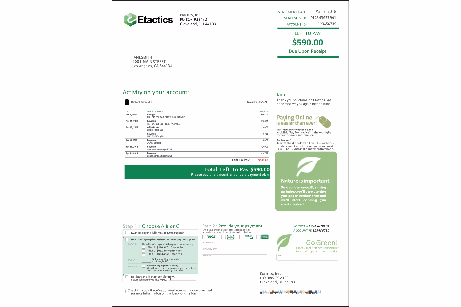
Our first example uses space to accomplish a patient-friendly design. While there’s a lot of information on this page, it doesn’t overwhelm the reader...
This is because there’s a balance of white space so that it doesn’t appear cramped. While looking at this example, you’ll notice your eye jumping from section to section naturally. That happens because the methodically placed white space guides you through the most important pieces of sectioned information.
The practice that designed this example wants their patients to look at these four sections in this order...
- Basic account and information (top right)
- Account activity and payment option (center left)
- Online payment signup (center right)
- Detailed payment information (bottom)
This design uses shape, such as the dark green box for the total in the activity table and the light green box for paying online. But the spacing of this statement also separates information as if there’s an invisible shape around it.
The following areas seem separated into rectangular sections, though they don’t use actual shapes:
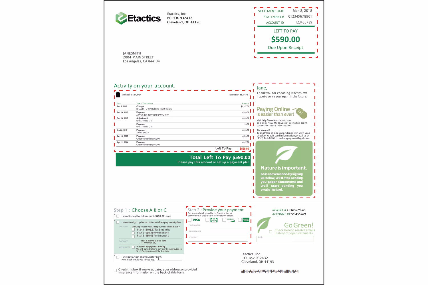
The designer could’ve made the text bigger or rearranged the information to fill the page. But instead, the designer used the white space to make the statement easier to follow and read. Negative space keeps the sections separated, even though they don’t use enclosing shapes to separate them.
Example 2: Color and Shape Reflect Branding

This example uses an emphasis on colored shapes to achieve a patient-friendly billing statement. First, the colors match the company logo to reinforce their brand. Second, patients can recognize who the bill is from without an issue, so they will know what the statement is for and who to pay.
The green shapes scattered throughout also help establish emphasis. Important information is within and surrounded by green to grab attention. These shapes separate areas such as the service table, aging buckets, and the credit card box. They help keep the information from blending with unrelated details, and the color draws attention to the areas.
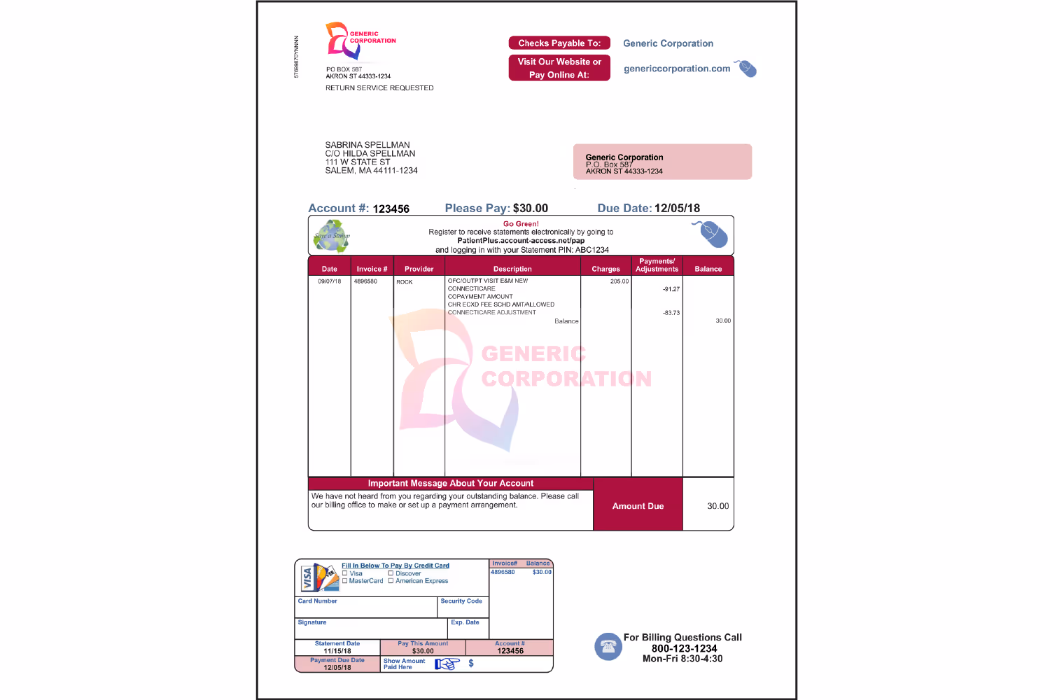
Example 3: Visual Hierarchy
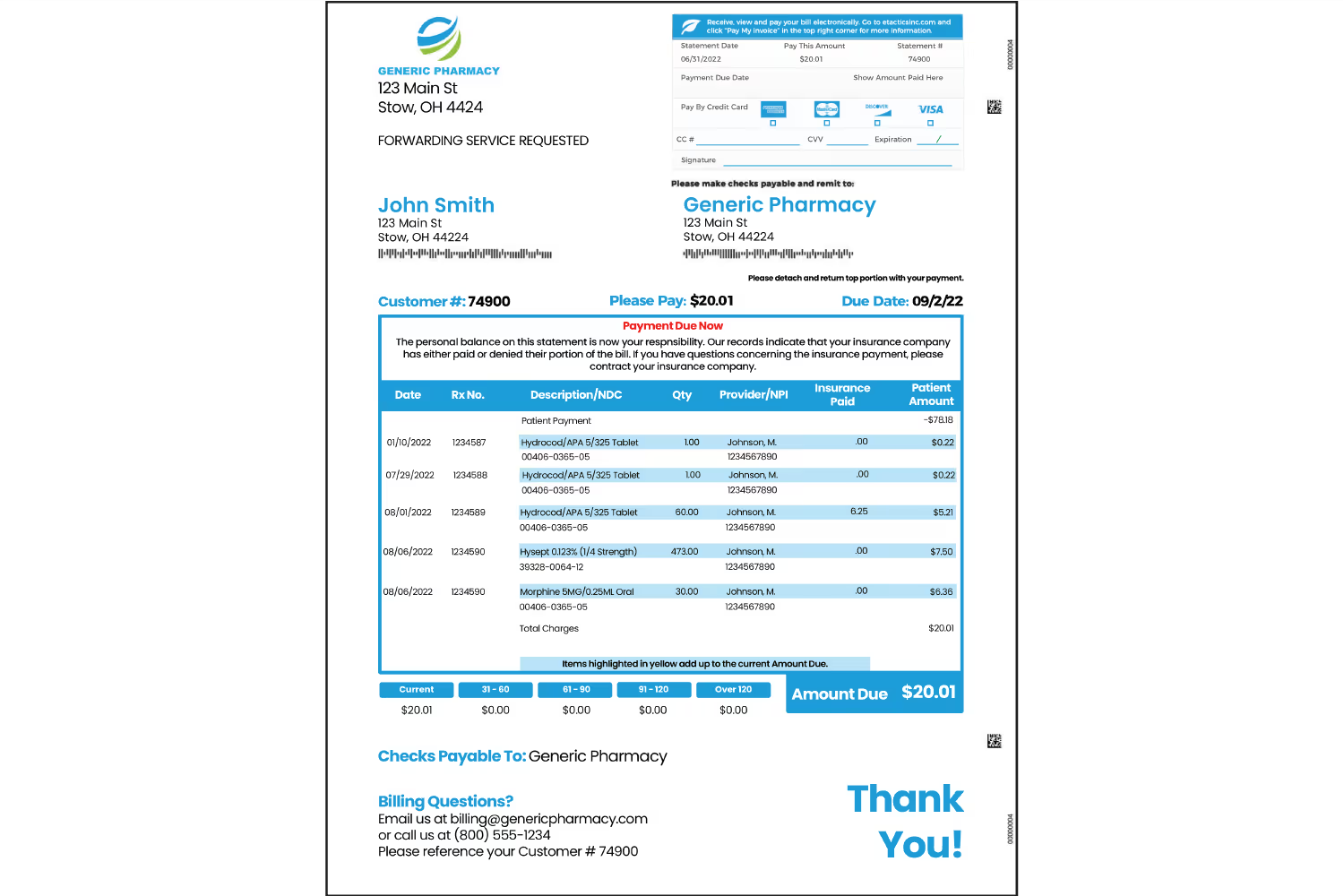
Out of all the examples thus far, this one has the most information. Having a ton of information on one page is overwhelming. However, it’s easy to follow along because of the design technique it uses.
This example achieves a visual hierarchy. It leads the eye down a path of what’s most important.
Visual hierarchy’s order elements based on importance. When a patient receives a bill, they want to know what their charges are from and how much they owe. This statement uses a visual step-by-step process so that there won’t be any questions or concerns from the recipient.
The largest element on the page is the table, which also uses the most color. This way, the patient sees it as the most important element. It’s the area that lists the services and the charges that correlate. The lighter shade of blue highlights the most important line of the description so that it’s easier to read. It helps align the text between all columns, so it’s easy to identify which charge corresponds to which item.
Once patients see the table, the blue draws their attention to the next important detail. They then notice the aging buckets and “Amount Due” box right below the table because of their proximity.
After patients determine what they owe, they want to know how to pay. Shape, size, and color emphasize the credit card box as the next important section. The details are within a rectangular box like the description table. It’s smaller than the table so patients don’t focus on it first, but it’s larger than the other sections so they know it’s still important.
This box also uses the bold blue with the rectangle, credit card graphics, and lines to grab attention. Since the graphics have color, they stand out to reiterate which payment methods are acceptable.
Patients still might have questions or concerns after they look at these sections. They may want to pay with a check, or they could have questions about charges or payment options. This is why the “Checks Payable To:” and “Billing Questions?” text is within blue.
It makes it easy to locate so the patient doesn’t need to spend time searching for it. If they have questions about paying but can’t find how to contact you, chances are they won’t make their payment.
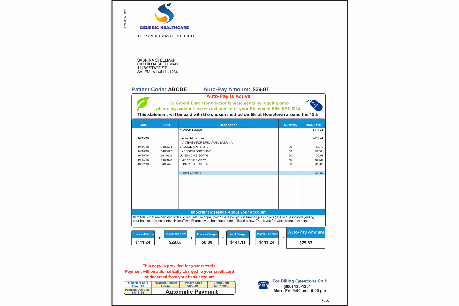
Example 4: Repetition to Reinforce
Using repetition helps reiterate the important details of this patient-friendly billing statement. This design uses repetition of shape, logo, color, and information.
The same round-edged rectangles around each area develop consistency. It’s easier to navigate a bill with unified elements because there isn’t too much contrast. With a lot of contrast, it’s hard to determine what to focus on because our eye bounces all over the page. But with consistent shapes, this statement doesn’t use excessive contrast.
Repeating the logo by adding it within the details table as a watermark makes it obvious who the bill is from. Consistent colors help keep the unity of the company branding in this design. There isn’t as much color as the last few examples, but it’s effective by highlighting the most important sections.
Not only are the important details in color, but they also repeat throughout. The total amount appears four times as the key detail, and the account number and payment date repeat twice. These details are in different sections too so that the patient doesn’t miss them. Color highlights them within the credit card box to remind the patient how much they’re paying, and when to pay.
Example 5: Visual Aids for Summation
This example uses an element that most of these other designs don’t. It includes a visual representation of the charges with descriptions to explain the breakdown of the total amount.
Reading lists of numbers and services can get confusing for some patients. Unless they pull out a calculator, they might not comprehend how the charges equate to the amount due. This leads to unnecessary phone calls to your practice asking for an explanation. You don’t want to have to handhold every patient by explaining their charges and total after each appointment.
Displaying these in a way that’s visual and comprehensive helps patients understand on their own. Use visual aids when possible to represent information that might not make sense to the general population. It can save confusion and time for both your patients and your team down the road.
Conclusion
After seeing these examples, you should have a better idea of how to enhance your statements. One important note is that each of the examples we’ve dissected throughout this blog post uses similar typography styles.
There are endless ways to design patient-friendly billing statements but looking at examples makes the process a little bit easier.
Take a look at some of the bills you receive in the mail for inspiration. Notice the areas that may seem frustrating for you to read and understand. Consider ways that you could improve these, and then implement them into your design.
Emphasize your product's unique features or benefits to differentiate it from competitors
In nec dictum adipiscing pharetra enim etiam scelerisque dolor purus ipsum egestas cursus vulputate arcu egestas ut eu sed mollis consectetur mattis pharetra curabitur et maecenas in mattis fames consectetur ipsum quis risus mauris aliquam ornare nisl purus at ipsum nulla accumsan consectetur vestibulum suspendisse aliquam condimentum scelerisque lacinia pellentesque vestibulum condimentum turpis ligula pharetra dictum sapien facilisis sapien at sagittis et cursus congue.
- Pharetra curabitur et maecenas in mattis fames consectetur ipsum quis risus.
- Justo urna nisi auctor consequat consectetur dolor lectus blandit.
- Eget egestas volutpat lacinia vestibulum vitae mattis hendrerit.
- Ornare elit odio tellus orci bibendum dictum id sem congue enim amet diam.
Incorporate statistics or specific numbers to highlight the effectiveness or popularity of your offering
Convallis pellentesque ullamcorper sapien sed tristique fermentum proin amet quam tincidunt feugiat vitae neque quisque odio ut pellentesque ac mauris eget lectus. Pretium arcu turpis lacus sapien sit at eu sapien duis magna nunc nibh nam non ut nibh ultrices ultrices elementum egestas enim nisl sed cursus pellentesque sit dignissim enim euismod sit et convallis sed pelis viverra quam at nisl sit pharetra enim nisl nec vestibulum posuere in volutpat sed blandit neque risus.
Use time-sensitive language to encourage immediate action, such as "Limited Time Offer
Feugiat vitae neque quisque odio ut pellentesque ac mauris eget lectus. Pretium arcu turpis lacus sapien sit at eu sapien duis magna nunc nibh nam non ut nibh ultrices ultrices elementum egestas enim nisl sed cursus pellentesque sit dignissim enim euismod sit et convallis sed pelis viverra quam at nisl sit pharetra enim nisl nec vestibulum posuere in volutpat sed blandit neque risus.
- Pharetra curabitur et maecenas in mattis fames consectetur ipsum quis risus.
- Justo urna nisi auctor consequat consectetur dolor lectus blandit.
- Eget egestas volutpat lacinia vestibulum vitae mattis hendrerit.
- Ornare elit odio tellus orci bibendum dictum id sem congue enim amet diam.
Address customer pain points directly by showing how your product solves their problems
Feugiat vitae neque quisque odio ut pellentesque ac mauris eget lectus. Pretium arcu turpis lacus sapien sit at eu sapien duis magna nunc nibh nam non ut nibh ultrices ultrices elementum egestas enim nisl sed cursus pellentesque sit dignissim enim euismod sit et convallis sed pelis viverra quam at nisl sit pharetra enim nisl nec vestibulum posuere in volutpat sed blandit neque risus.
Vel etiam vel amet aenean eget in habitasse nunc duis tellus sem turpis risus aliquam ac volutpat tellus eu faucibus ullamcorper.
Tailor titles to your ideal customer segment using phrases like "Designed for Busy Professionals
Sed pretium id nibh id sit felis vitae volutpat volutpat adipiscing at sodales neque lectus mi phasellus commodo at elit suspendisse ornare faucibus lectus purus viverra in nec aliquet commodo et sed sed nisi tempor mi pellentesque arcu viverra pretium duis enim vulputate dignissim etiam ultrices vitae neque urna proin nibh diam turpis augue lacus.