How to Make Patient Statement Templates That Don't Suck
Making patient statements that appeal to the masses doesn’t need to be so time-consuming and challenging. But, if you aren’t a designer you might not know where to start. Let’s look at six resources and how they can help you create your patient statement templates.

Have you ever received a bill in the mail and thought to yourself, “This sucks.”
Of course, paying a bill isn’t the best experience in the world. But this isn’t what I’m referring to.
Sometimes, the statements we get in the mail look terrible which makes them confusing. When they’re unappealing to look at, it makes those who receive them less likely to focus on the details. Believe it or not, this will likely cause to not pay what they owe.
It might sound tedious to make statements that look nice, but it’s necessary so patients will pay the correct amount on time. After all, if they don’t understand how much they owe or when it’s due, they won’t pay which directly affects your revenue.
Making patient statements that appeal to the masses doesn’t need to be so time-consuming and challenging. But, if you aren’t a designer you might not know where to start.
Luckily, there are already tools that exist to help you make statement templates so you don’t spend effort figuring it out.
Some of these tools are free and accessible to anyone. While others do have a cost, it’s cheaper to use these softwares than to outsource a designer. A freelance graphic designer could cost anywhere between $100 and $850 on average.
It’s even more economical to use these products than it is to send poorly designed bills that your patients won’t pay. So what are some of the best tools to get you started?
Let’s look at six resources and how they can help you create your patient statement templates.
Remember, these are only for a template. you'll still need to work with a true statement print and mail provider to input your patients' information because you should never add sensitive information within these programs.
Canva
Canva is by far the easiest option for non-designers.
It’s a free service that anyone can use by setting up an account. Some premium elements require a fee, but there are many design options with a free account.
Canva has premade templates for different layouts such as presentations, invoices, and infographics. You can choose one of these layouts or create a design with custom dimensions. It’s variety means that you could even use it to design your patient education material.
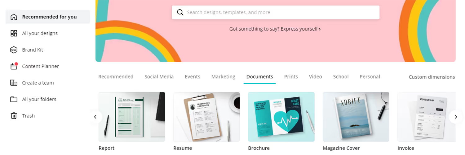
Once you select your layout, there will be a blank workspace with tools on the left. The first of these tools is templates which will be the best starting point for you to make statements. You can use the “Search templates” bar to narrow your options such as by color to fit your branding.
After you select your favorite template, you can go in a few different directions.
You can either use it as a starting point and change its elements, or you can leave the design as is. If you decide to leave it as it is, you just need to change the prefilled text to the details that your statement needs. You can then save the document as a PDF, JPG, or PNG.
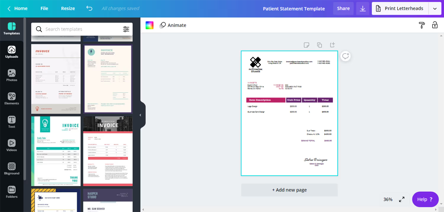
Of course, it will take more time the more you edit the template, but it will still be easier than starting from scratch. It’s possible to add or remove any elements that the premade design already has.
For example, you can add graphics to your contact information so it stands out more. All images can get swapped for a photo from the service’s free library or your own uploads. If you don’t like the order of the information, all elements are draggable so you can reorder them.
No matter what the template looks like, Canva allows you to change elements to fit your branding. The platform has a large variety of fonts and colors to choose from.
If you’re using this service because you aren’t a designer, then it’s good to follow the layout of the template. But if you have fonts and colors you always use in your branding, you can adjust these to fit your style.
While you’ll most likely begin by just following the template, this is a good starting tool for learning to design statements. After some time using the features and getting to know good layouts, you can even start creating from scratch.
Photoshop
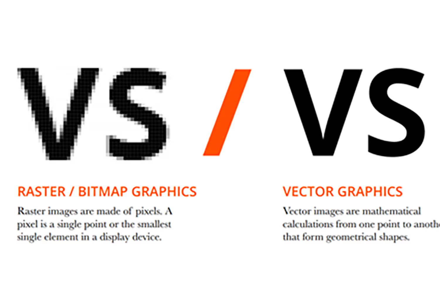
Photoshop is an Adobe creative product often used for photo editing. But you can use it for page layout design, too. It uses pixels instead of vectors so it’s intended for photos and raster-based art.
The drawback to this kind of artwork is that resizing it affects the quality, so don’t use this if you’ll need to scale your pages.
Photoshop takes more time understanding than Canva because it doesn’t have premade designs and it has even more tools. But it’s one of the easiest Adobe creative apps to learn and you’ve likely used it before in some capacity already because it’s so popular.
If you have difficulty learning how to use it, Adobe’s website can help you get started. It has tutorials and lessons for learning basic tools, enhancing skills, and answering questions.
Since the Adobe Creative Suite is so popular, there are also thousands of Youtube tutorials from users that will help you along the way as well.
Illustrator
This vector-based Adobe app is better for scalable work. You can size artwork as small or as large as you need, but it won’t lose resolution because vectors create smooth lines.
The tools are similar to Photoshop, though they don’t have the exact capabilities.
Illustrator is easier for working with shapes and text. You can quickly resize, reuse, and manipulate elements in Illustrator so it’s faster when designing an entire page.
Illustrator even lets you create new documents with a “New from Template” option. These let you create documents that have similar settings and elements. This way you can set up a document for all your statements with the same size, view settings like guides, and print options.
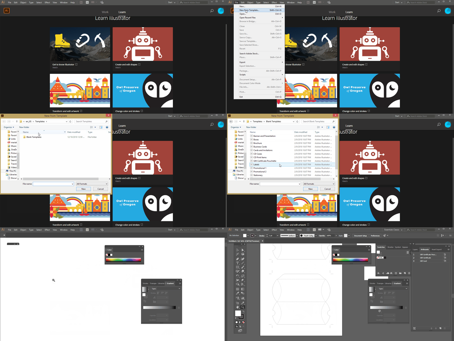
Templates also have color swatches, brushes, and symbols for design elements. This way you can edit all your statements from a premade file that already has the basic settings you’ll need.
When you select one of these files, Illustrator makes a new document with the exact content and settings as the template. But the original template stays the same.
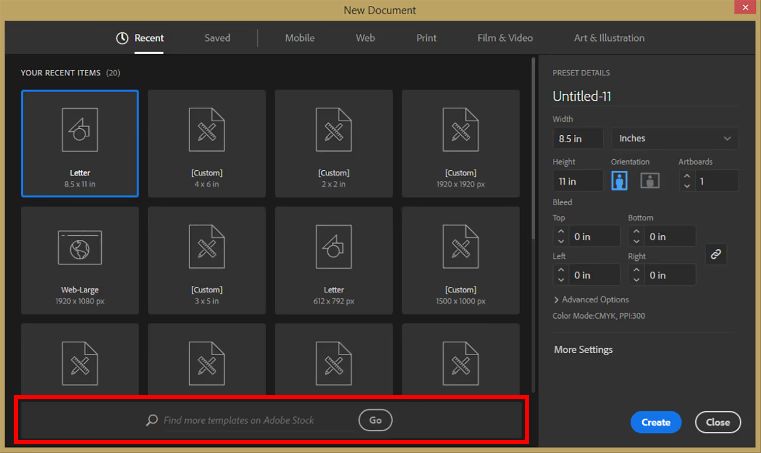
Illustrator comes with some templates like the one shown in the above gif. But you can find more from Adobe Stock to add to your library. I’ll explain more about this product later.
InDesign
The final Adobe creative app creating patient statement templates that don’t suck is InDesign. This is the best app for designing from scratch. It’s intended to have template capabilities with its master page feature.
The product allows for the creation of many pages, especially if they’re similar. Adding elements to the master page is the fastest way to create templates. If you apply the master design to another page, then any elements on it automatically get added to those pages.
This is the best option if you have different statements with only slight variations. For example, you may have layouts that all have the same design with only a different message box for certain notices.
With InDesign’s master page, you can quickly make all of the variations with this product.
You can use a combination of these three Adobe creative products depending on what you need to include in your statements.
Illustrator is useful to make graphics, Photoshop is best to edit images, and InDesign combines these elements to apply each to a page.
Each of the Adobe creative apps requires a monthly fee, but you can bundle them for a better deal if you want to use them all.
Adobe Stock
Adobe Stock is compatible with the Adobe products that I already mentioned. It has a large library of premade assets. This is similar to Canva but works with the Adobe creative apps.

You have to buy the license to use assets, but you can get a one-month free trial. You can filter the assets by which product you’ll be using to make sure you buy one that best fits your needs. This is helpful if you want to use Illustrator’s template feature.

If you don’t want to make the extra purchase, this is a good place to look for inspiration. Then you can create templates based on these concept ideas.
FreePik
This is like Adobe Stock but it has free options as the name suggests.
Of course, there are some premium options if you want to spend the extra money on more creative styles. But a lot of the free files are good for beginners.
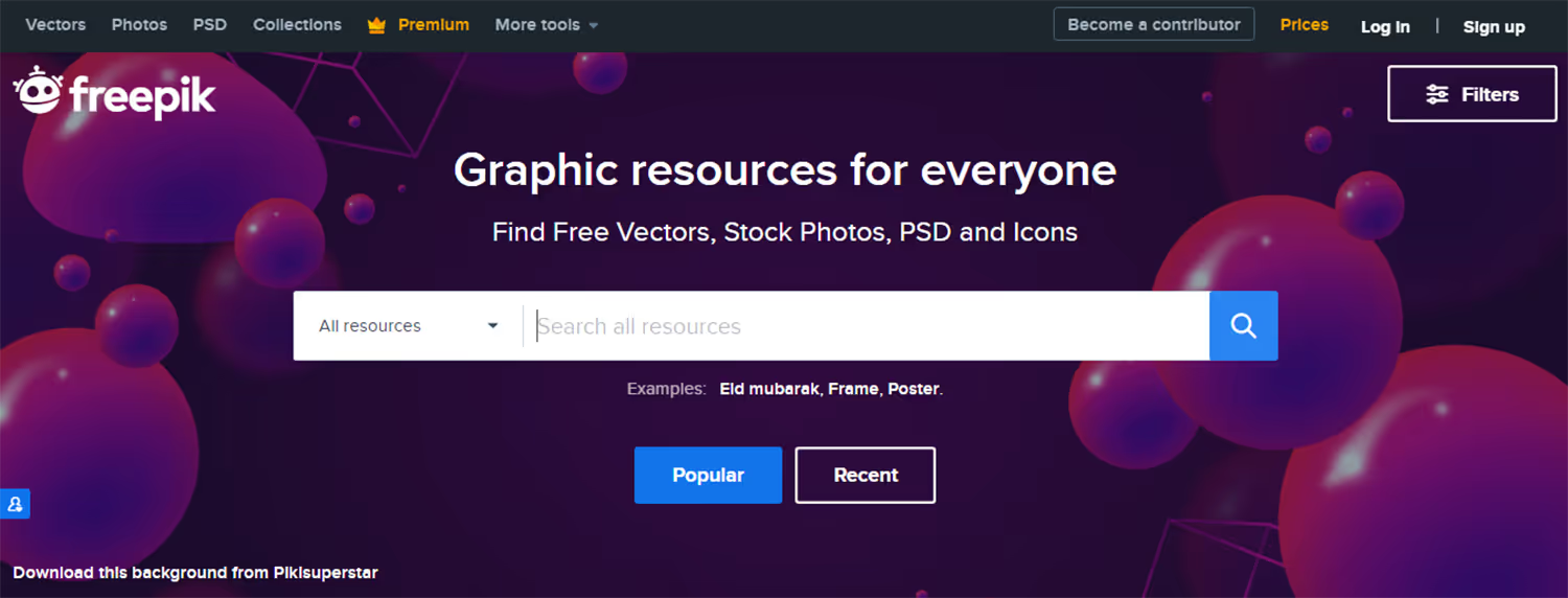
FreePik has both vectors and images available to download. You can sort by vector or image depending on what you’ll need and which program you’ll use.
Each item lists its file type so you’ll know if it’s best for Photoshop or Illustrator.
Again, you can use these as a starting point by making any desired changes or basing your design on the inspiration you find with the site.
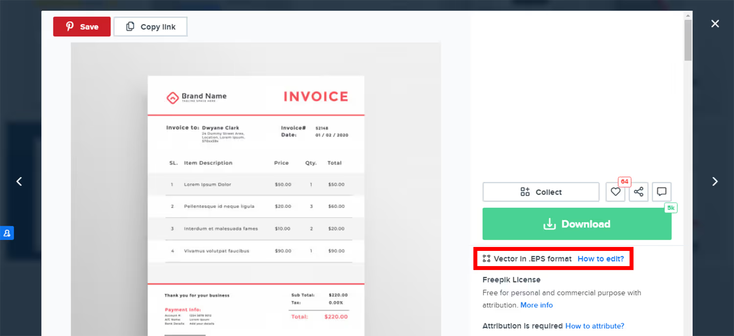
But it’s possible to make it even easier and just substitute the template information and colors for your own. These can be as simple or as advanced as you make them.
Conclusion
Even if you aren’t a designer, there are tools you can use to make your organization’s patient statement templates.
You don’t want your clients to open their bills and think, “This sucks, I can’t even figure out how much I owe.” While we all know they don’t want to pay, a well-formatted statement will make them more inclined to do so.
It will make it easier for them to understand how much they owe, when, and how to pay. And, if the design catches their attention, they won’t forget about it by letting it get lost in another pile of junk mail.
You might not have a clue where to start with designing. But that’s why there are tutorials, premade templates, and design inspiration right at your fingertips online. You can access so many options that are ready to go once you fill in your practice’s information. Or you can spend more time perfecting it to fit your brand and style.
Whichever direction you decide to go, you’ll improve the more you use these tools. You might feel discouraged at first trying to learn all of the features and capabilities. But if you start simply by using premade templates, you’ll get the hang of making more changes on your own.
Eventually, you’ll be able to start from scratch to design your own perfect patient statement template.
Emphasize your product's unique features or benefits to differentiate it from competitors
In nec dictum adipiscing pharetra enim etiam scelerisque dolor purus ipsum egestas cursus vulputate arcu egestas ut eu sed mollis consectetur mattis pharetra curabitur et maecenas in mattis fames consectetur ipsum quis risus mauris aliquam ornare nisl purus at ipsum nulla accumsan consectetur vestibulum suspendisse aliquam condimentum scelerisque lacinia pellentesque vestibulum condimentum turpis ligula pharetra dictum sapien facilisis sapien at sagittis et cursus congue.
- Pharetra curabitur et maecenas in mattis fames consectetur ipsum quis risus.
- Justo urna nisi auctor consequat consectetur dolor lectus blandit.
- Eget egestas volutpat lacinia vestibulum vitae mattis hendrerit.
- Ornare elit odio tellus orci bibendum dictum id sem congue enim amet diam.
Incorporate statistics or specific numbers to highlight the effectiveness or popularity of your offering
Convallis pellentesque ullamcorper sapien sed tristique fermentum proin amet quam tincidunt feugiat vitae neque quisque odio ut pellentesque ac mauris eget lectus. Pretium arcu turpis lacus sapien sit at eu sapien duis magna nunc nibh nam non ut nibh ultrices ultrices elementum egestas enim nisl sed cursus pellentesque sit dignissim enim euismod sit et convallis sed pelis viverra quam at nisl sit pharetra enim nisl nec vestibulum posuere in volutpat sed blandit neque risus.
Use time-sensitive language to encourage immediate action, such as "Limited Time Offer
Feugiat vitae neque quisque odio ut pellentesque ac mauris eget lectus. Pretium arcu turpis lacus sapien sit at eu sapien duis magna nunc nibh nam non ut nibh ultrices ultrices elementum egestas enim nisl sed cursus pellentesque sit dignissim enim euismod sit et convallis sed pelis viverra quam at nisl sit pharetra enim nisl nec vestibulum posuere in volutpat sed blandit neque risus.
- Pharetra curabitur et maecenas in mattis fames consectetur ipsum quis risus.
- Justo urna nisi auctor consequat consectetur dolor lectus blandit.
- Eget egestas volutpat lacinia vestibulum vitae mattis hendrerit.
- Ornare elit odio tellus orci bibendum dictum id sem congue enim amet diam.
Address customer pain points directly by showing how your product solves their problems
Feugiat vitae neque quisque odio ut pellentesque ac mauris eget lectus. Pretium arcu turpis lacus sapien sit at eu sapien duis magna nunc nibh nam non ut nibh ultrices ultrices elementum egestas enim nisl sed cursus pellentesque sit dignissim enim euismod sit et convallis sed pelis viverra quam at nisl sit pharetra enim nisl nec vestibulum posuere in volutpat sed blandit neque risus.
Vel etiam vel amet aenean eget in habitasse nunc duis tellus sem turpis risus aliquam ac volutpat tellus eu faucibus ullamcorper.
Tailor titles to your ideal customer segment using phrases like "Designed for Busy Professionals
Sed pretium id nibh id sit felis vitae volutpat volutpat adipiscing at sodales neque lectus mi phasellus commodo at elit suspendisse ornare faucibus lectus purus viverra in nec aliquet commodo et sed sed nisi tempor mi pellentesque arcu viverra pretium duis enim vulputate dignissim etiam ultrices vitae neque urna proin nibh diam turpis augue lacus.


