

Prescription Label Design: Why It Matters and Effective Examples
If patients can’t read or understand their prescription label, they’re less likely to follow directions or they won’t know the warnings. Thankfully, there are ways to improve label design so that people do understand how to adhere to their treatment.

When you buy a product that comes with an instruction manual, do you ever actually read it?
We might think we know how to use the product on our own out of our own stubbornness. But a lot of times this doesn’t work and not following the directions ends up backfiring.
Unfortunately, this practice carries over into health treatments as well. But healthcare is one area that consumers can’t ignore instructions. Unfortunately, it does happen and it causes non-adherence.
When it comes to medication, patients must read the directions and warnings so they know how to follow their treatment.
A PLOS One study found that older groups were less likely to focus on prescription directions than younger groups. Both groups spent even less time viewing warning labels.
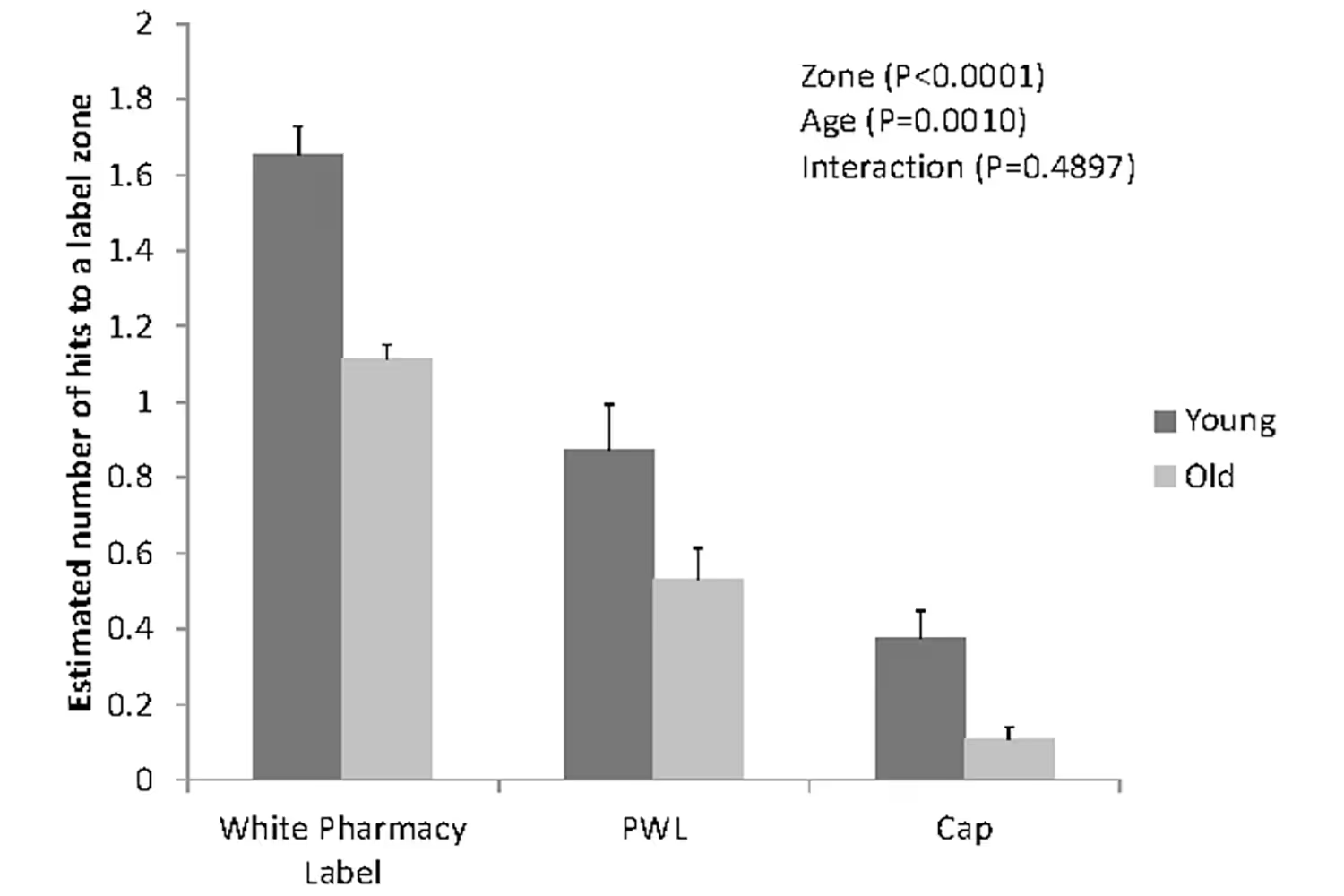
However, the problem isn’t always with the patient. Sometimes, labels make it too difficult to understand the details.
They could have poor readability so people can’t decipher the directions or warnings. The information might also be too close together. That could explain why older groups viewed these labels less; if they can’t read them, they might not spend much time looking at them out of frustration.
But this is why prescription label design matters so much. If patients can’t read them, they’re less likely to follow directions or they won’t know the warnings. Thankfully, there are ways to improve label design so that people do understand how to adhere to their treatment.
Improved Readability
If patients can’t read the prescription label design, they’ll misunderstand directions and not follow their treatment. Many factors can decrease readability. While they might seem like subtle aspects, they impact those who are trying to understand their prescription.
The container label’s size is one of the first things that can impact readability. If it’s too small, then text might need to be smaller so it all fits. But the smaller the text, the more a patient will struggle to read it.

Prescriptions should always use a font that is easy to read and isn’t lightweight or condensed. Recommended sizes are usually larger, often 12-point sans serif, which makes it easier to read.
Color contrast also influences readability. There needs to be enough contrast between the colors of the text and container so that there’s enough legibility. It’s necessary to avoid color combinations that aren’t as easily legible, such as yellow text on a white background.
Layout of Information
The design layout helps improve consumers’ experience when reading and understanding labels. The US Food and Drug Administration (FDA) has recommendations for best layout practices.
First, the text on both the container and carton should all be in the same direction. This means using horizontal or vertical text, but not both.
Each section should also have adequate white space and margins surrounding it. This improves readability and avoids crowding. If details are too close together, consumers could get confused about which details relate to each other. It should be clear which details go with which section. It’s even helpful to include a diagram with the breakdown of items to reinforce what each means.
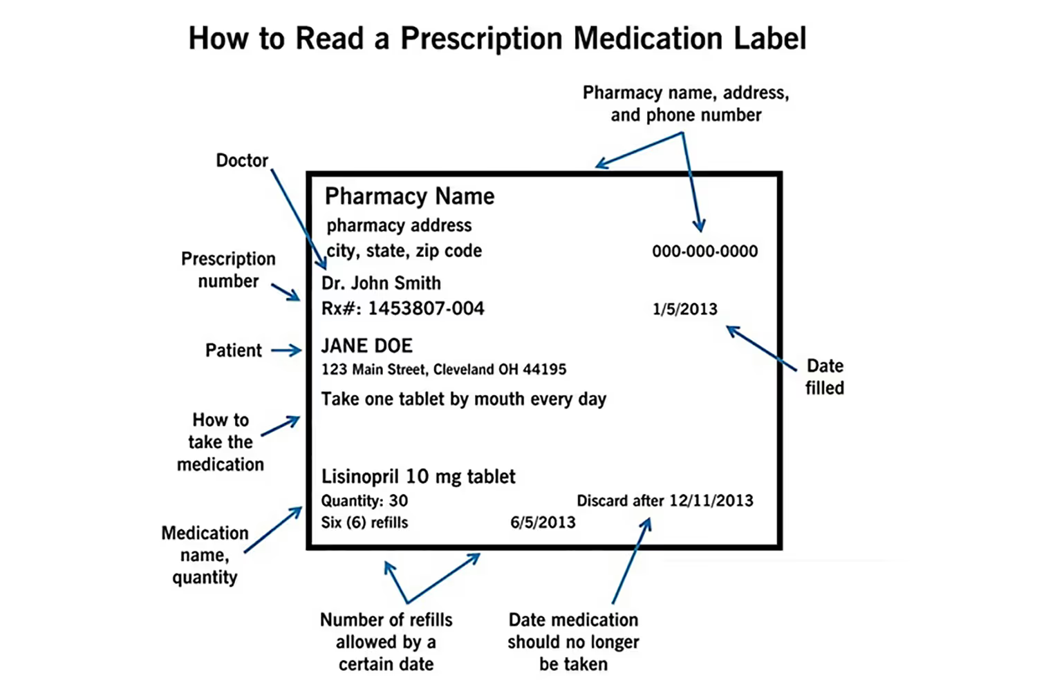
Relevant information should be in the same field of vision so that consumers don’t need to turn or rotate the container.
The principal display panel (PDP) is the main area displayed and includes the most important information. Like I mentioned before, if the container label is too small then not all information will fit. This also causes the most important details to not fit on the PDP.
Another necessary section is a black box warning. This keeps the serious side effects, such as injury or death, together. It prevents the patient from missing the most important warnings to lower risks.
Some prescription bottles use warning stickers that get added over the main label. If this is the case, these shouldn’t cover up any necessary details. Patients are more likely to miss whatever is underneath. Some over-the-counter bottles avoid this by using a peel-back tab. This prompts the consumer to read further details.

If a container does use this option, the top section should still include what’s most critical. Otherwise, consumers might think that what was on top is all they need to know. But in reality, the section underneath lists the warnings, directions, ingredients, and side effects. This is why the first panel displayed, such as the PDP, should list whatever is most necessary for the patient to know.
Color and Graphics
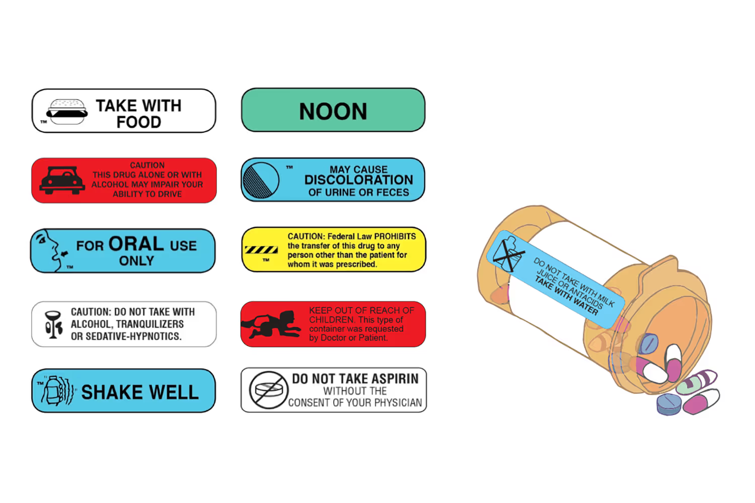
Visuals help emphasize text. As mentioned already, color adds contrast to draw attention to specific details. These could be highlights of headings or colored warning stickers. One designer went a step further to solve a major cause of prescription misuse.
Taking the wrong drug is one of the main causes of medication errors.
Children are victims of this problem, too. A previous study found that kids ages six to 12 years old were the most likely to unintentionally take another person’s medication. This even results from someone accidentally giving them the wrong medication.
Deborah Adler found design inspiration after her grandmother experienced this error. She took her husband’s medication by mistake, thinking it was her own. Both grandparents had the initials of H. Adler on their pill bottles which looked similar. So Adler created a color-coded ring system for Target’s pharmacy.

The ClearRx System has a choice of six different colored rings. This helps patients identify which bottle is theirs or their family members’. It also helps differentiate prescriptions for those who take several medications in a day but have different dosages.
Graphics can also draw attention to important details so patients avoid medication errors. Using graphics on warning labels makes it easy for consumers to know what to avoid. These can also visually represent the dose amount and the time of day to take it. But using too many graphics can make it appear cluttered, so only use them to reiterate the most important facts.
Always Include These Details
Not only does layout, color, and readability affect a consumer’s understanding of a prescription. But so does the information that is actually on the bottle.
The layout, text size, and label size all impact how much can fit onto the bottle without it being too overcrowded. When it starts getting crowded, it’s more likely that some necessary data will be lacking.
But this isn’t helpful for anyone because we can’t read minds.
Unless it’s on the bottle, we’re unlikely to know facts about the medicine we’re taking. Consumer Reports staffers wanted to compare drug labels, warnings, and information. They filled prescriptions for the drug warfarin at five pharmacies: Costco, CVS, Target, Walgreens, and Walmart.
Warfarin is a commonly-used blood thinner. It causes dangerous bleeding if it isn’t used correctly which leads to emergency room visits. Because of this risk, it’s fair to expect this drug to have clear warnings and instructions no matter which pharmacy provides it.
But Consumer Reports found something different. None of the warnings were identical, and each lacked a warning that another did include. Costco had a misleading warning about alcohol consumption. The warning stated the following:
“If you drink alcohol, discuss the safe use of alcohol while taking this medication with your healthcare professional.”
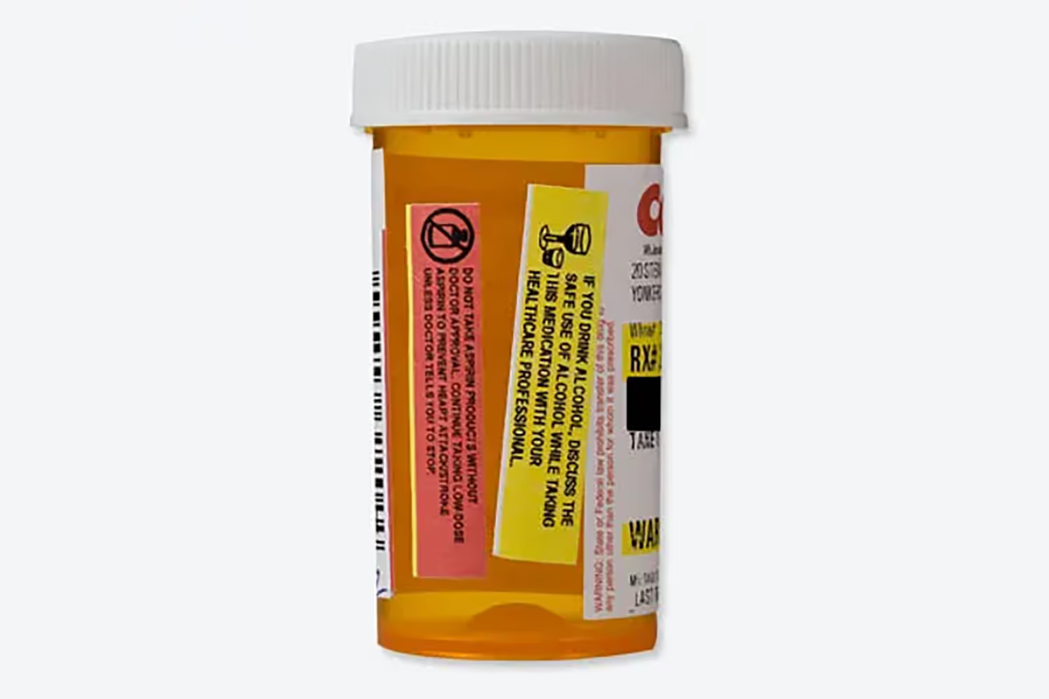
But this is inconsistent with the FDA’s approved information which states, “Avoid alcohol consumption.” Costco’s warning makes it seem that consuming alcohol could be safe and to first discuss it with a healthcare professional.
But the FDA’s warning states to avoid it, suggesting that any consumption is unsafe.
Walmart’s bottle had the most drastic difference between the five pharmacies. While each of the others had inconsistent warnings, they at least had one. The warfarin prescription from the Walmart location did not include any.
For a drug that can have serious bleeding if taken incorrectly, it’s extremely dangerous to not include any warning. Consumers won’t know when to avoid taking the medication or what other lifestyle habits to avoid.
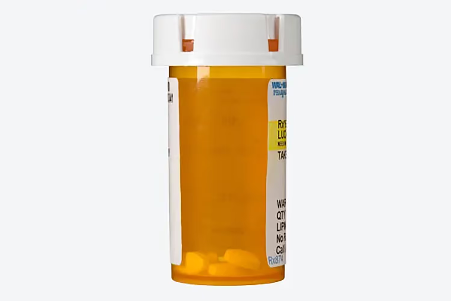
Consumer Reports staffers decided to fill the prescription at two different Walmart locations. These attempts did include warnings, but each was different.
It’s necessary to include the correct warnings because taking a drug improperly can have serious negative effects. All facts that could impact the patient’s quality of life should be on the bottle.
And the most important facts should be within the principal display panel. In its label recommendations, the FDA recommends that the PDP should include the following...
- Proprietary name
- Established name or proper name
- Product strength
- Route(s) of administration
- Any warnings or cautionary statements
This helps the consumer find the most necessary facts first since it’s the section primarily displayed.
Clear Verbiage
After determining what should be on the bottle, it’s time to focus on the verbiage. Details can be misleading if the phrasing is unclear. For example, the Costco label that I mentioned earlier did include the necessary warning but the statement made it unclear about what was safe.
Dosage directions are often confusing, too. Consumer Reports noted this in their conclusion. The phrase “twice daily” isn’t a clear instruction…
- How long should patients wait to take the second dose?
- Should they take it when they wake up and before bed, or with breakfast and dinner?

These times can vary a lot depending on the person’s lifestyle, so verbiage should be clear.
But if a patient should take the pill every twelve hours, then the bottle phrase should state that. Graphics can also help with any unclear language by showing the patient their dose amount and at which time to take it.
Conclusion
Such a small label can make a big difference in a patient’s adherence to medication. Even though the details on this space are subtle, minor adjustments can improve consumers’ understanding of the drug.
Healthcare providers must focus on prescription label design. If the text is too hard to read, patients will easily misunderstand their instructions. The design can also influence how much information fits onto the label. Any details that influence medication adherence must be on the bottle so patients know how to follow directions.
The verbiage of these details can be confusing which also leads to a misuse of medication. But graphics and color can help reiterate or visualize the instructions so they’re easier to understand and retain.
While each of these aspects might seem subtle, it will make a dramatic difference for those reading their prescriptions. And they could then spend more time viewing the label to fully understand the instructions.
Emphasize your product's unique features or benefits to differentiate it from competitors
In nec dictum adipiscing pharetra enim etiam scelerisque dolor purus ipsum egestas cursus vulputate arcu egestas ut eu sed mollis consectetur mattis pharetra curabitur et maecenas in mattis fames consectetur ipsum quis risus mauris aliquam ornare nisl purus at ipsum nulla accumsan consectetur vestibulum suspendisse aliquam condimentum scelerisque lacinia pellentesque vestibulum condimentum turpis ligula pharetra dictum sapien facilisis sapien at sagittis et cursus congue.
- Pharetra curabitur et maecenas in mattis fames consectetur ipsum quis risus.
- Justo urna nisi auctor consequat consectetur dolor lectus blandit.
- Eget egestas volutpat lacinia vestibulum vitae mattis hendrerit.
- Ornare elit odio tellus orci bibendum dictum id sem congue enim amet diam.
Incorporate statistics or specific numbers to highlight the effectiveness or popularity of your offering
Convallis pellentesque ullamcorper sapien sed tristique fermentum proin amet quam tincidunt feugiat vitae neque quisque odio ut pellentesque ac mauris eget lectus. Pretium arcu turpis lacus sapien sit at eu sapien duis magna nunc nibh nam non ut nibh ultrices ultrices elementum egestas enim nisl sed cursus pellentesque sit dignissim enim euismod sit et convallis sed pelis viverra quam at nisl sit pharetra enim nisl nec vestibulum posuere in volutpat sed blandit neque risus.
Use time-sensitive language to encourage immediate action, such as "Limited Time Offer
Feugiat vitae neque quisque odio ut pellentesque ac mauris eget lectus. Pretium arcu turpis lacus sapien sit at eu sapien duis magna nunc nibh nam non ut nibh ultrices ultrices elementum egestas enim nisl sed cursus pellentesque sit dignissim enim euismod sit et convallis sed pelis viverra quam at nisl sit pharetra enim nisl nec vestibulum posuere in volutpat sed blandit neque risus.
- Pharetra curabitur et maecenas in mattis fames consectetur ipsum quis risus.
- Justo urna nisi auctor consequat consectetur dolor lectus blandit.
- Eget egestas volutpat lacinia vestibulum vitae mattis hendrerit.
- Ornare elit odio tellus orci bibendum dictum id sem congue enim amet diam.
Address customer pain points directly by showing how your product solves their problems
Feugiat vitae neque quisque odio ut pellentesque ac mauris eget lectus. Pretium arcu turpis lacus sapien sit at eu sapien duis magna nunc nibh nam non ut nibh ultrices ultrices elementum egestas enim nisl sed cursus pellentesque sit dignissim enim euismod sit et convallis sed pelis viverra quam at nisl sit pharetra enim nisl nec vestibulum posuere in volutpat sed blandit neque risus.
Vel etiam vel amet aenean eget in habitasse nunc duis tellus sem turpis risus aliquam ac volutpat tellus eu faucibus ullamcorper.
Tailor titles to your ideal customer segment using phrases like "Designed for Busy Professionals
Sed pretium id nibh id sit felis vitae volutpat volutpat adipiscing at sodales neque lectus mi phasellus commodo at elit suspendisse ornare faucibus lectus purus viverra in nec aliquet commodo et sed sed nisi tempor mi pellentesque arcu viverra pretium duis enim vulputate dignissim etiam ultrices vitae neque urna proin nibh diam turpis augue lacus.
![[ANSWERED] Which is The Recommended Method for Verifying an Email's Legitimacy?](https://cdn.prod.website-files.com/67e2b8210878abcba6f91ae6/68a75a13dbd4dfdf3ce65c38_VerifyingEmailLegitimacy_323.avif)

![[ANSWERED] Why Was HIPAA Created?](https://cdn.prod.website-files.com/67e2b8210878abcba6f91ae6/68a731cd4c28e1bbd14a5ee6_WhyWasHIPAACreated_223.avif)